• 12 Portfolios / Project Samples
  • Clients
  • Resume
  • Software
  • Contact
  • Blog
  • THREE: 2020 (My Novel)
Menu

Hugh Shipman Portfolio

DESIGNER FOR HIRE AND FREELANCE
  • 12 Portfolios / Project Samples
  • Clients
  • Resume
  • Software
  • Contact
  • Blog
  • THREE: 2020 (My Novel)

12 PORTFOLIOS / Project samples


My SDI logo rendered in 3D as polished aluminum on a masonry floor. On the left, it begins in wireframe which merges into the final rendering on the right.

introducing payment online!

Working with me as your designer just got even better! I now accept payments online to initiate a project. In addition, my Contact page allows for clients to upload files to me, making communications easier. Projects are defined with what I call an RFP-R (request for proposal response management document) which outlines phases of services, approximate timeframes and what products will be provided upon completion. On request, to help facilitate communications and teamwork with some clients, I utilize management programs such as Figma and MS Teams during the design-building processes. I guarantee your satisfaction. I provide REAL creative solutions based on years of experience, not AI imitations.

Click below on the 12 portfolios—Signage, Branding / Logos, Print Design, etc. to see samples of my work.

FUTURE UPDATE for late 2024 / 2025

Stay tuned! A new addition to my portfolio website will be a gallery of my digital art for sale which can be processed and paid online. It will include specialized pieces not shown in my portfolios along with some showings from my Flickr site. Each piece will be available in various sizes, and will be signed and numbered. Upon request, they can be either framed or delivered in tube format.

Portfolio 1: Focus Project: Atlanta Coca-Cola ROXY Theater

The Coca-Cola ROXY Theater is an Atlanta landmark, and it was a special privilege to be the designer of its new image. As the design progressed, a large amount of 3D was used in order to visualize the concept as well as present to government approval agencies.

The project took nearly six months from start to finish and the grand opening came complete with television and radio media on-site.

Fabricator: William Bloodworth/AIM (Architectural Image Manufacturers)

Coca-Cola ROXY Theater

The project began with the development of a new identity for the theater.

Coca-Cola ROXY Theater

Once the rough concepts were approved, I produced a complete set of architectural CAD/BIM drawings for construction.

Coca-Cola ROXY Theater

Once the rough concepts were approved, I produced a complete set of architectural CAD/BIM drawings for construction.

Coca-Cola ROXY Theater

Once the rough concepts were approved, I produced a complete set of architectural CAD/BIM drawings for construction.

Coca-Cola ROXY Theater

Once the rough concepts were approved, I produced a complete set of architectural CAD/BIM drawings for construction.

Coca-Cola ROXY Theater

Once the rough concepts were approved, I produced a complete set of architectural CAD/BIM drawings for construction.

Coca-Cola ROXY Theater

Once the rough concepts were approved, I produced a complete set of architectural CAD/BIM drawings for construction. On this page are the door vinyls print-and-cut.

Coca-Cola ROXY Theater

3D modeling view.

Coca-Cola ROXY Theater

3D modeling view

Coca-Cola ROXY Theater

3D modeling view—night

Coca-Cola ROXY Theater

Completed project—exterior signage—day.

Coca-Cola ROXY Theater

Completed project—exterior signage—night.

Coca-Cola ROXY Theater

Completed project—exterior signage—night (tight shot)

Coca-Cola ROXY Theater

Interior shot—digital marketing

Portfolio 2: Focus Project: Coca-Cola Clock

Working with the Coca-Cola special projects division, I designed this for a theme park in Orlando, Florida. It was manufactured, shipped and installed by Architectural Image Manufacturers in Atlanta, Georgia.

Coca-Cola Clock--1993--1.jpg
Coca-Cola Clock--1993--2.jpg
Coca-Cola Clock--1993--3.jpg
Coca-Cola Clock--1993--4.jpg

Portfolio 3: Logos / Corporate Branding Programs

Do not get AI to “make” a logo (or anything) for you. None of the work here was done that way. AI goes out and takes existing materials without permission which means that whatever AI does, it cannot be trademarked or copyrighted.

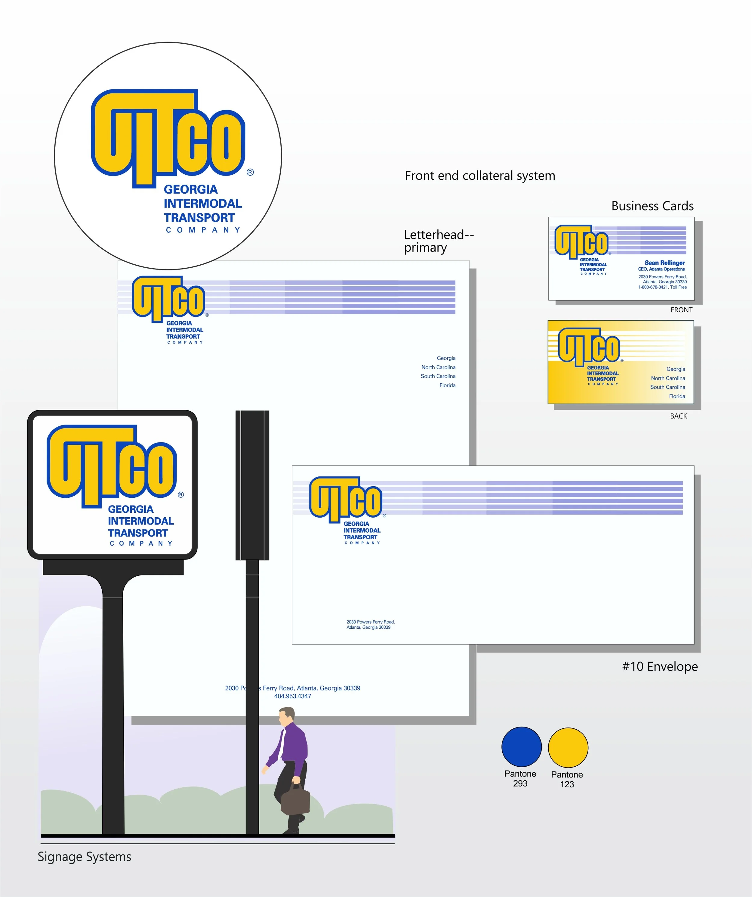
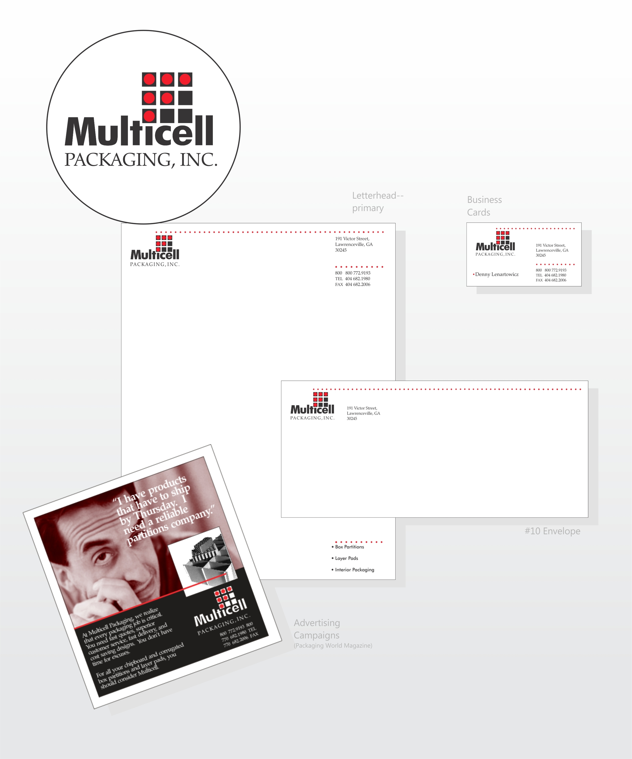
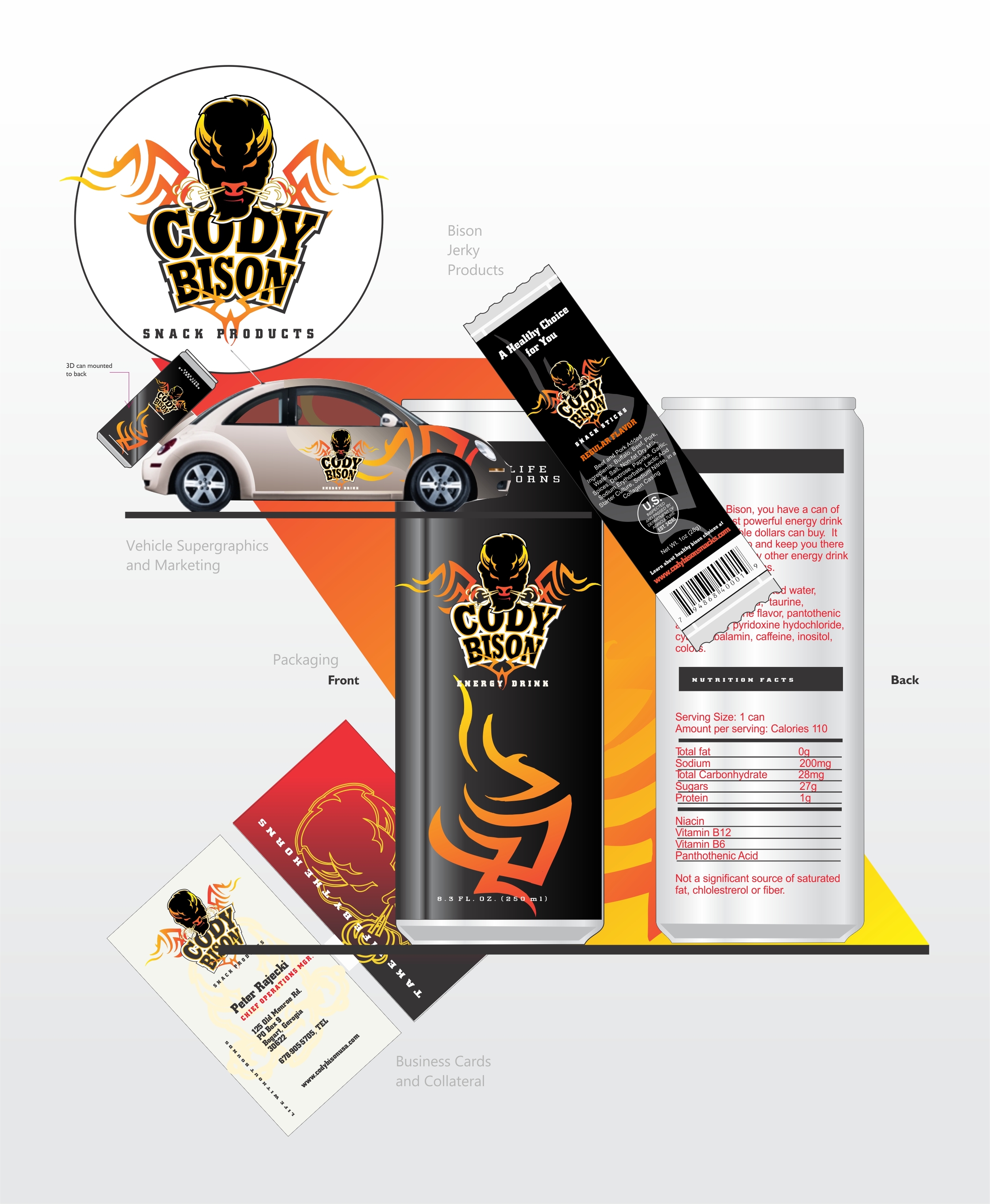
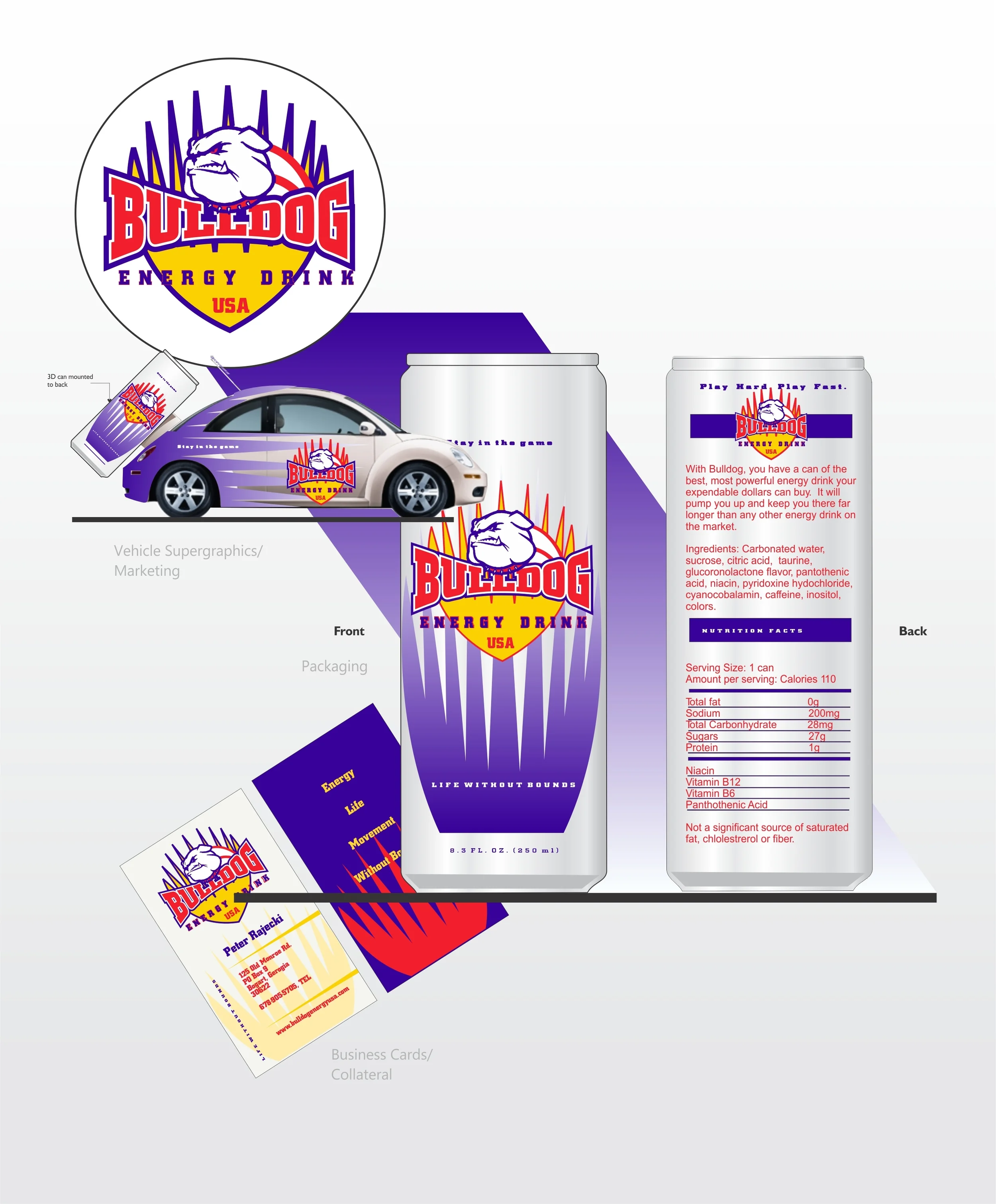
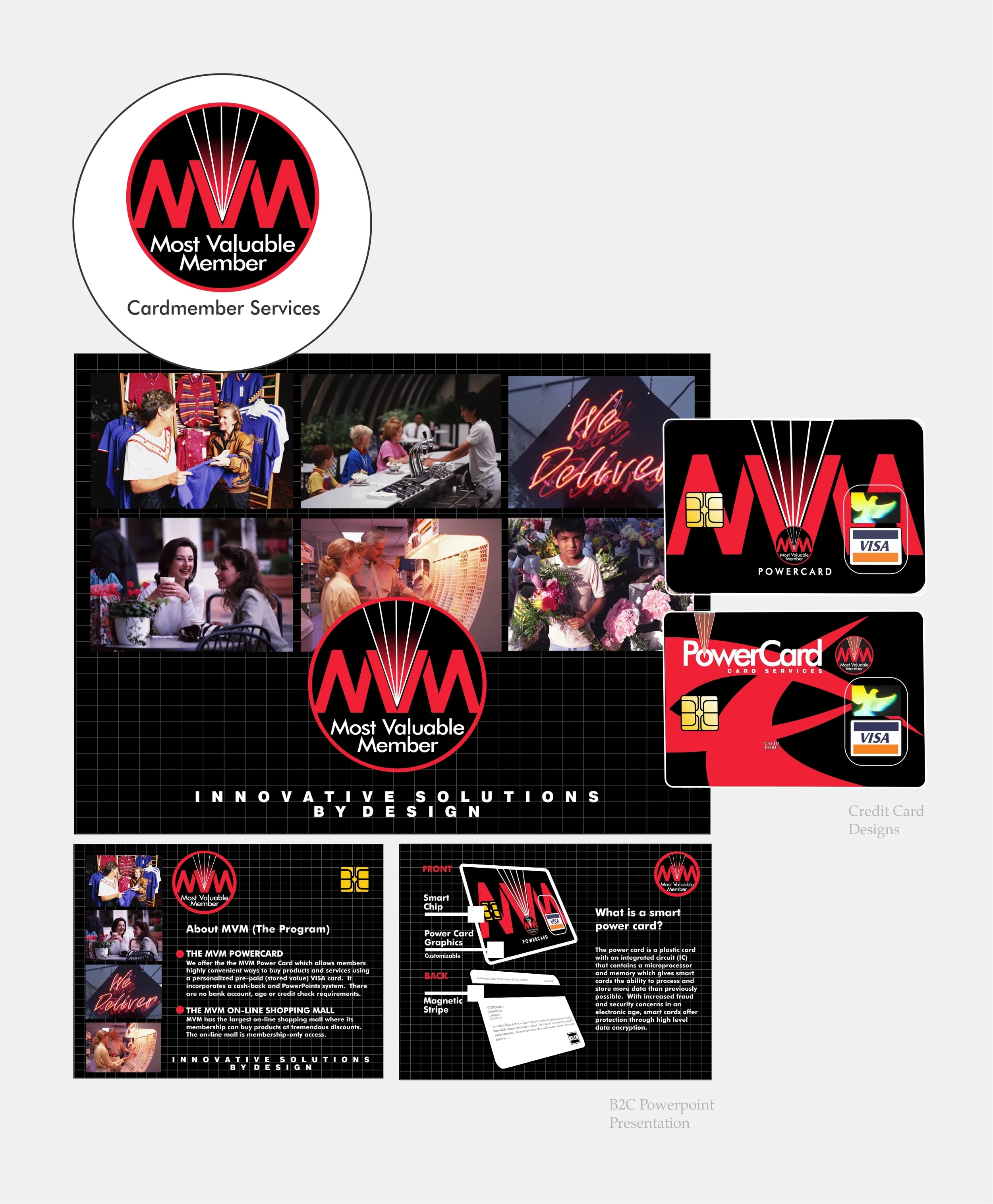
The logo for a corporation, business or institution is everything.  Early in my career, I learned that a company's logo is the apex around which everything revolves.  A properly-designed logo defines the business it represents and separates it from everyone else.

These days, printing companies that actually have money for media advertising (how did that happen?) would have you believing it’s about foil stamping, colorful borders, and fancy clip art on your business cards printed on some clever plastic substrate. Um, no. It’s all about the logo—you know, a REAL logo created using the “rules of identity”, not some clip art knock-off.

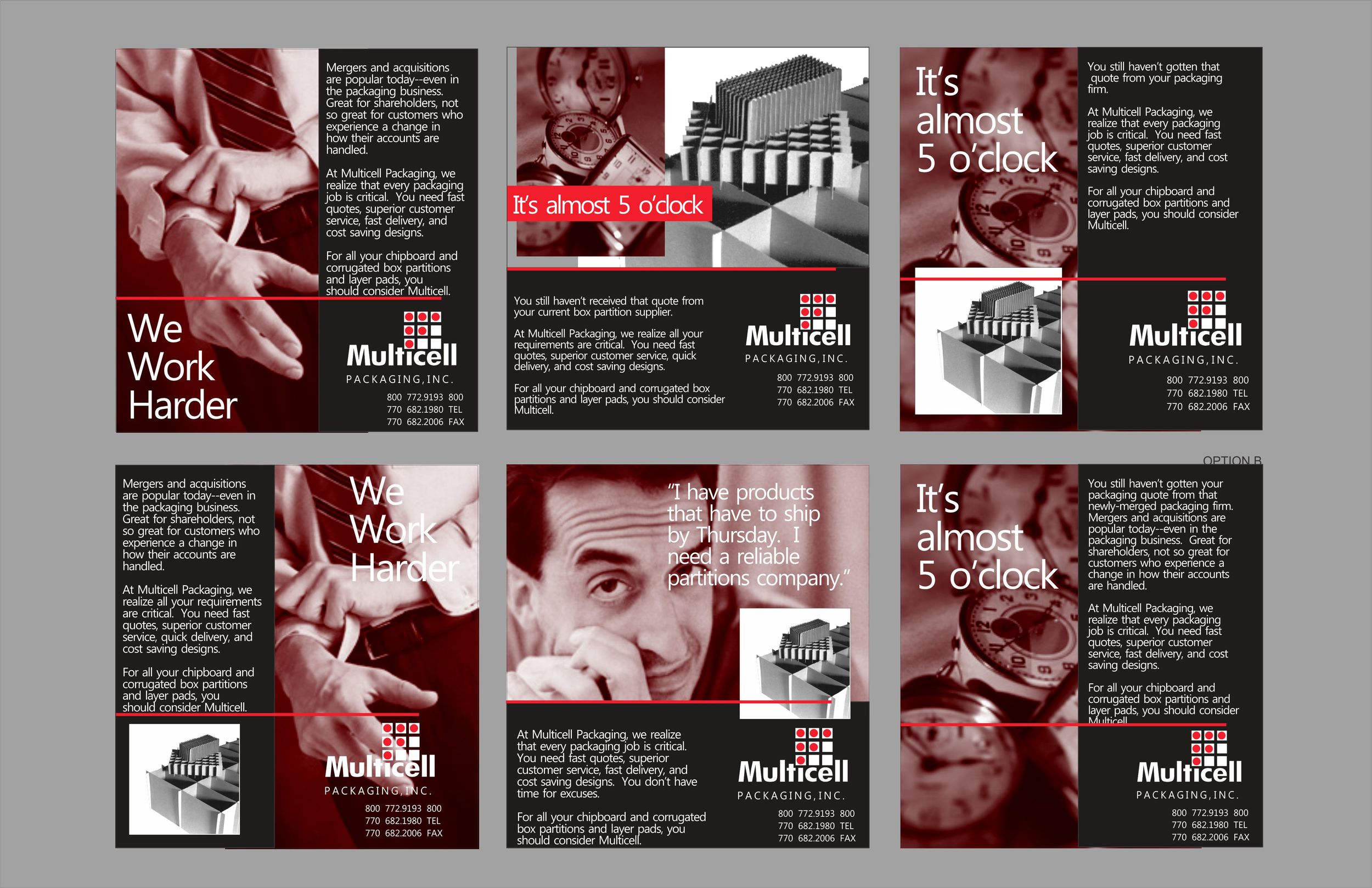
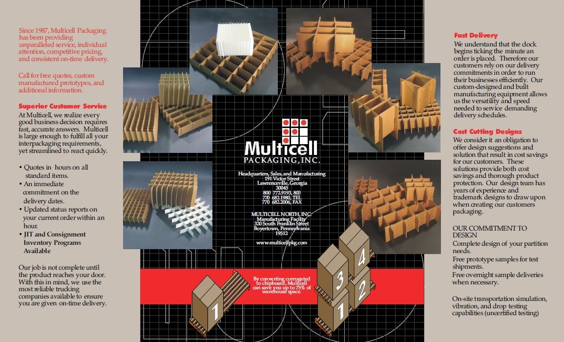
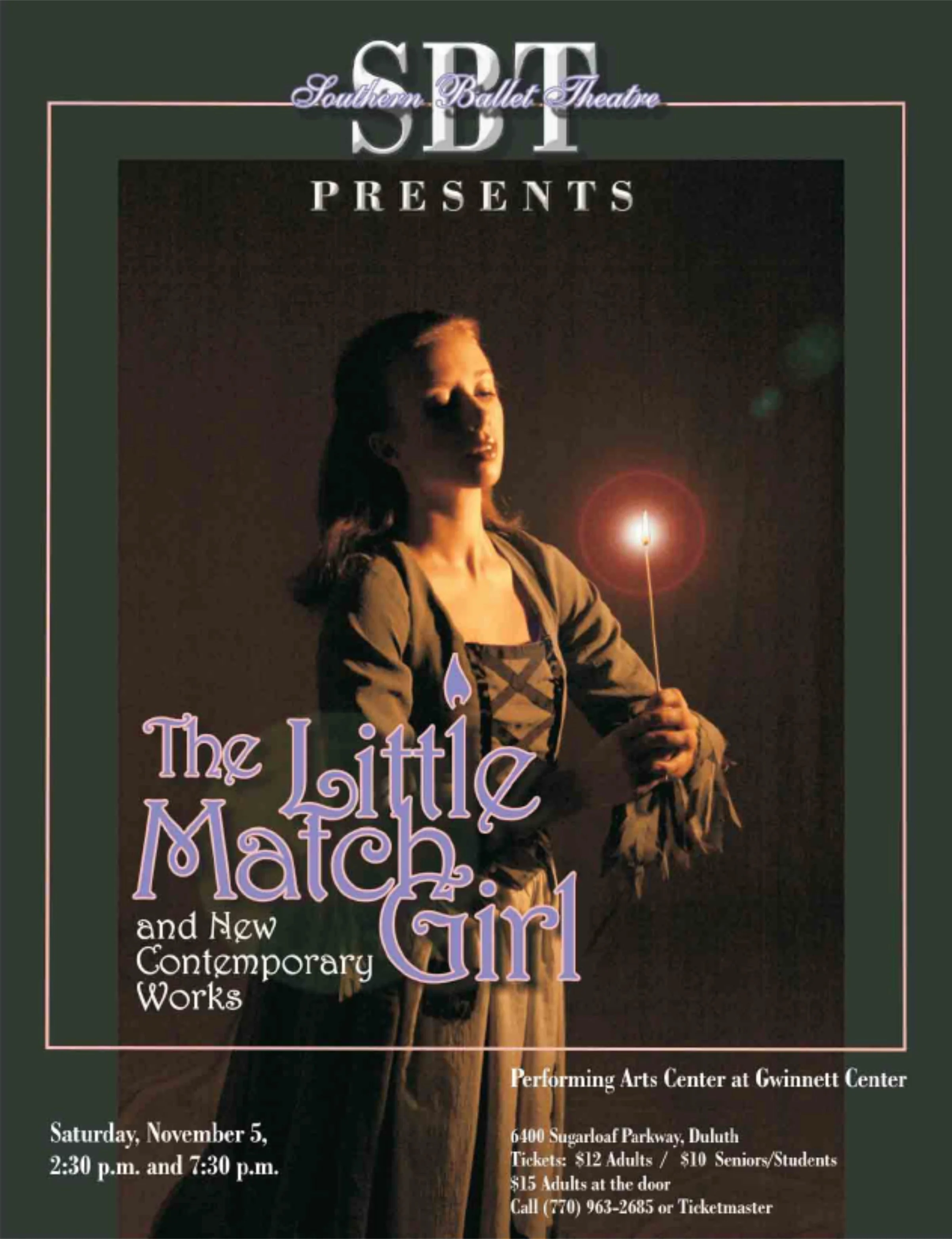
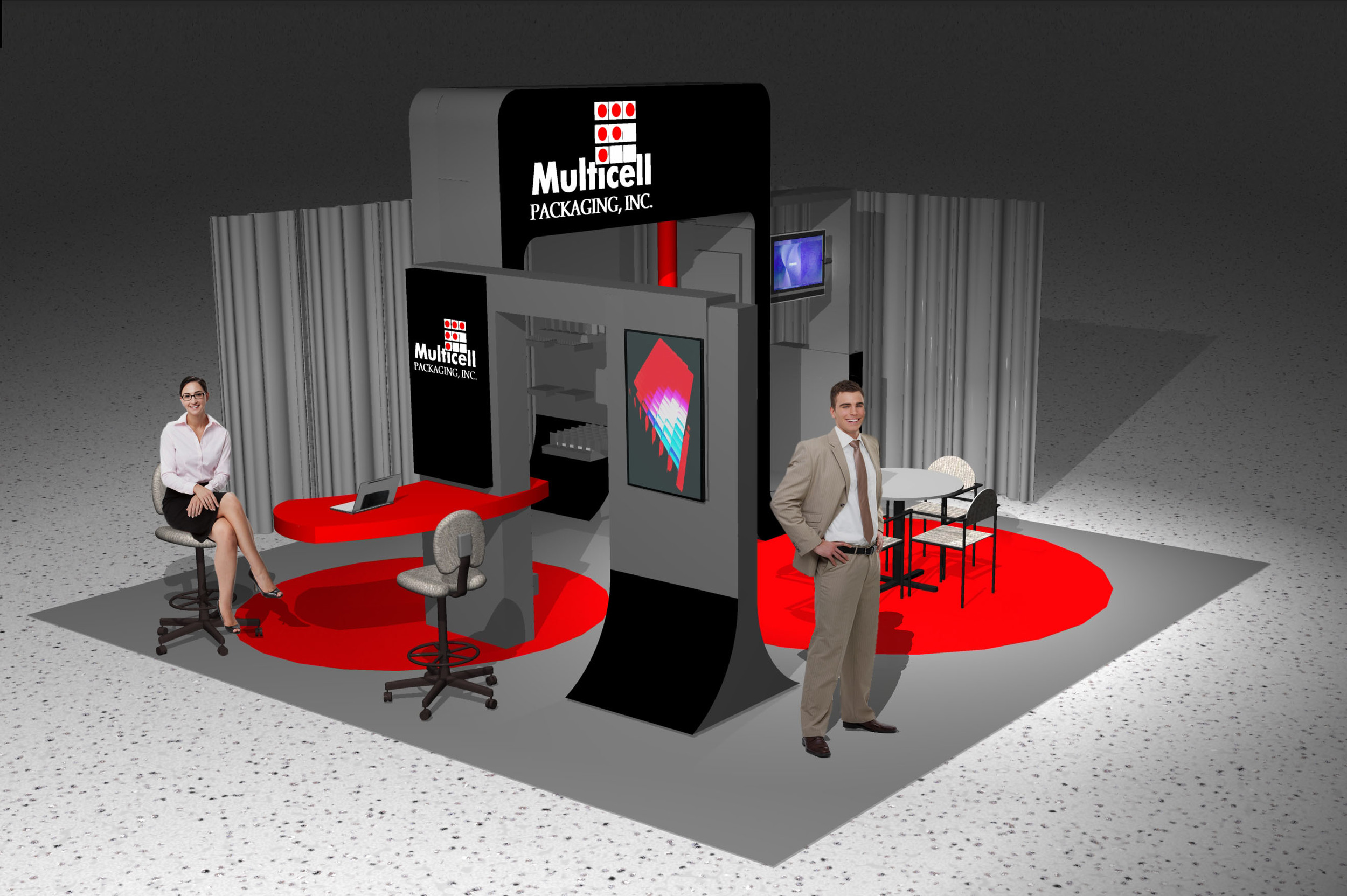
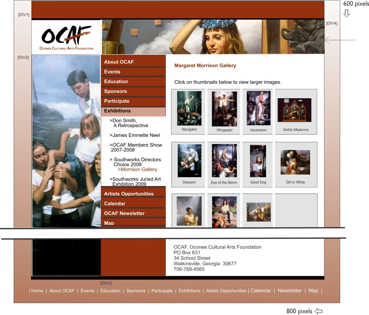
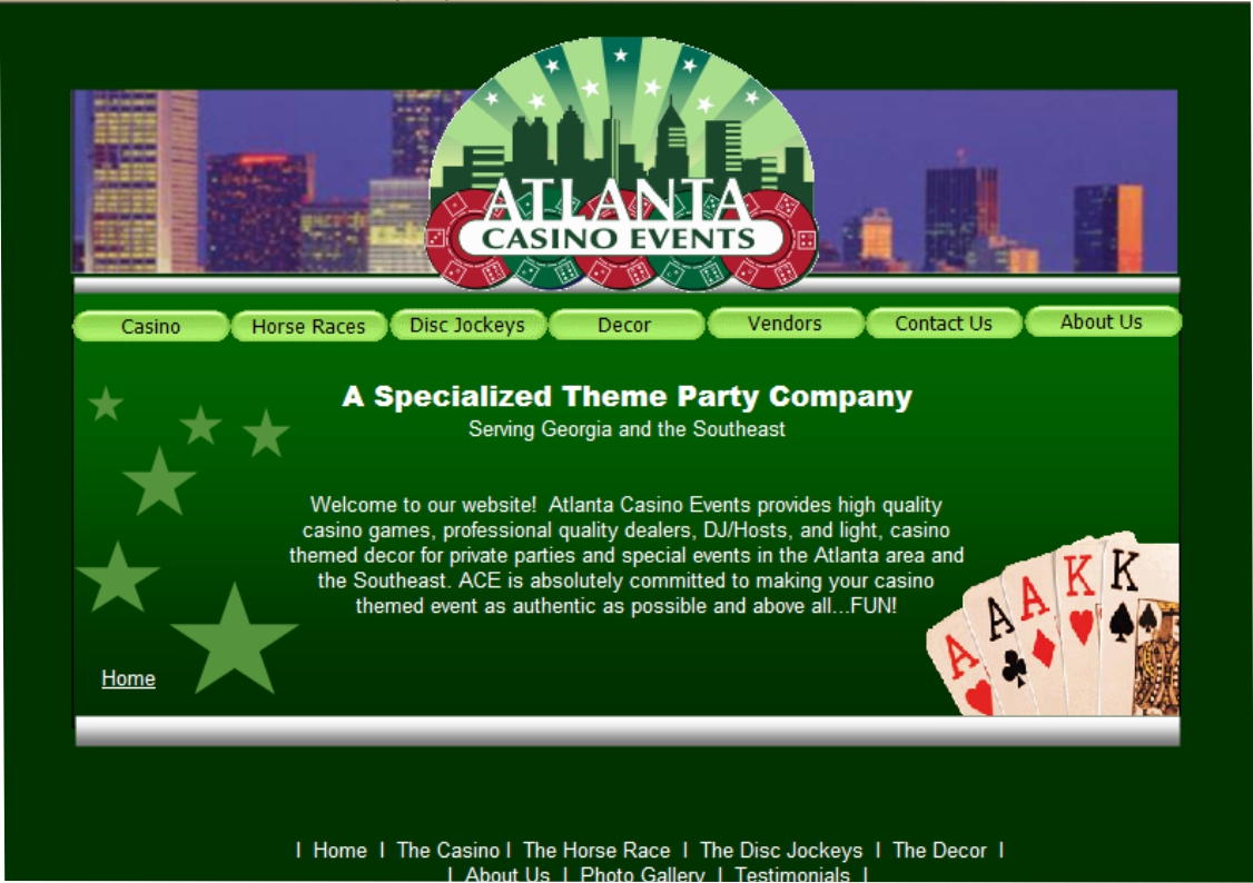
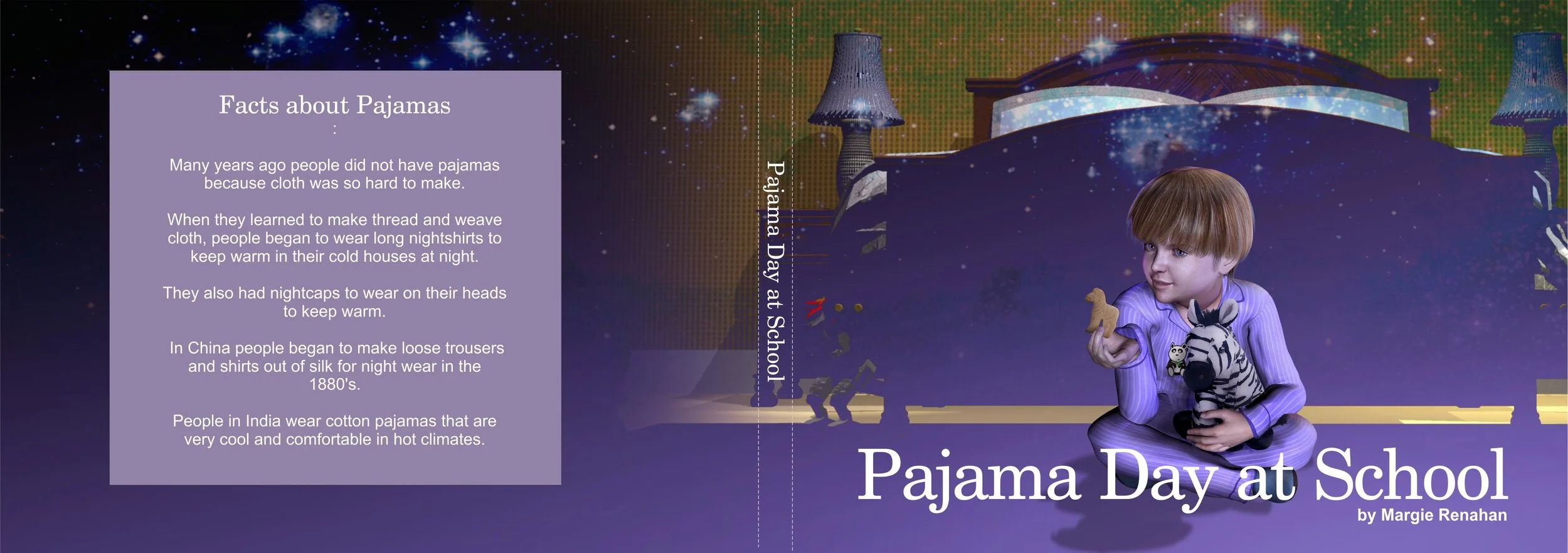
I have worked on identity projects in retail, manufacturing, non-profit, healthcare, hospitality, products and more.

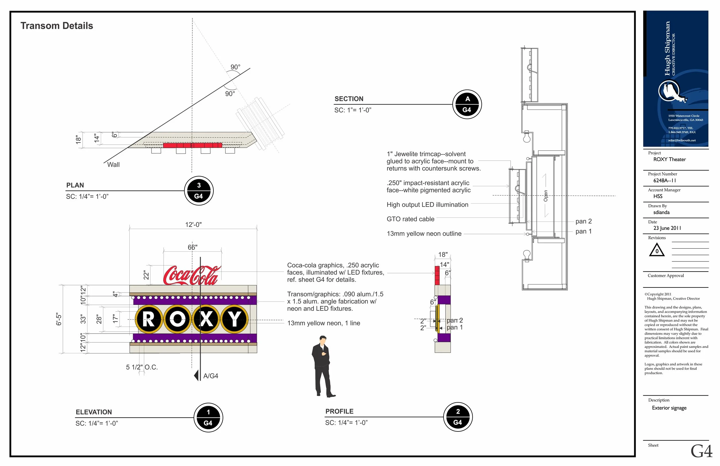
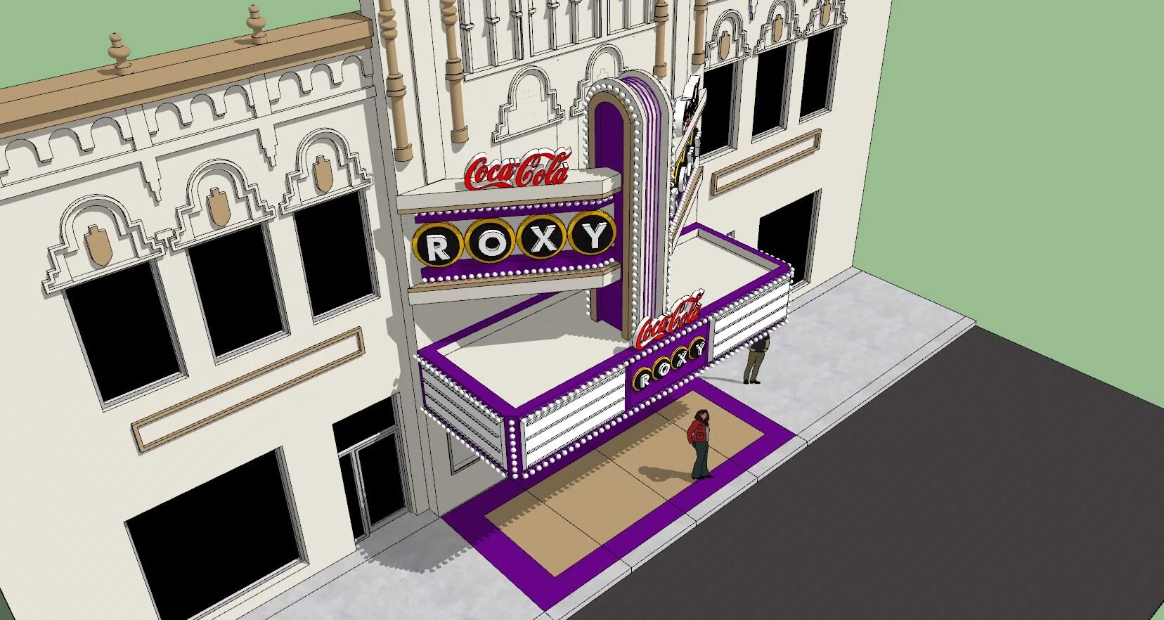
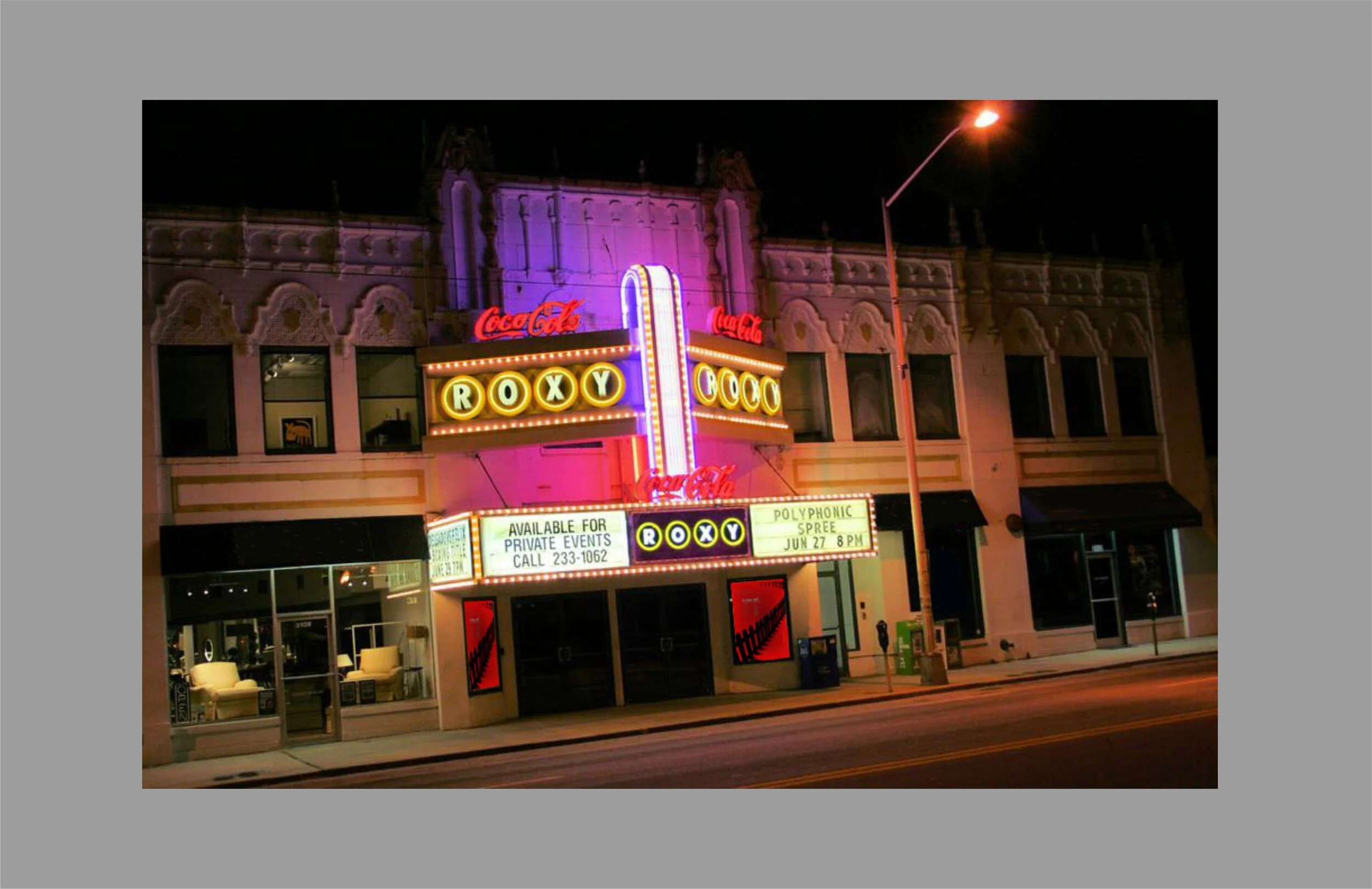
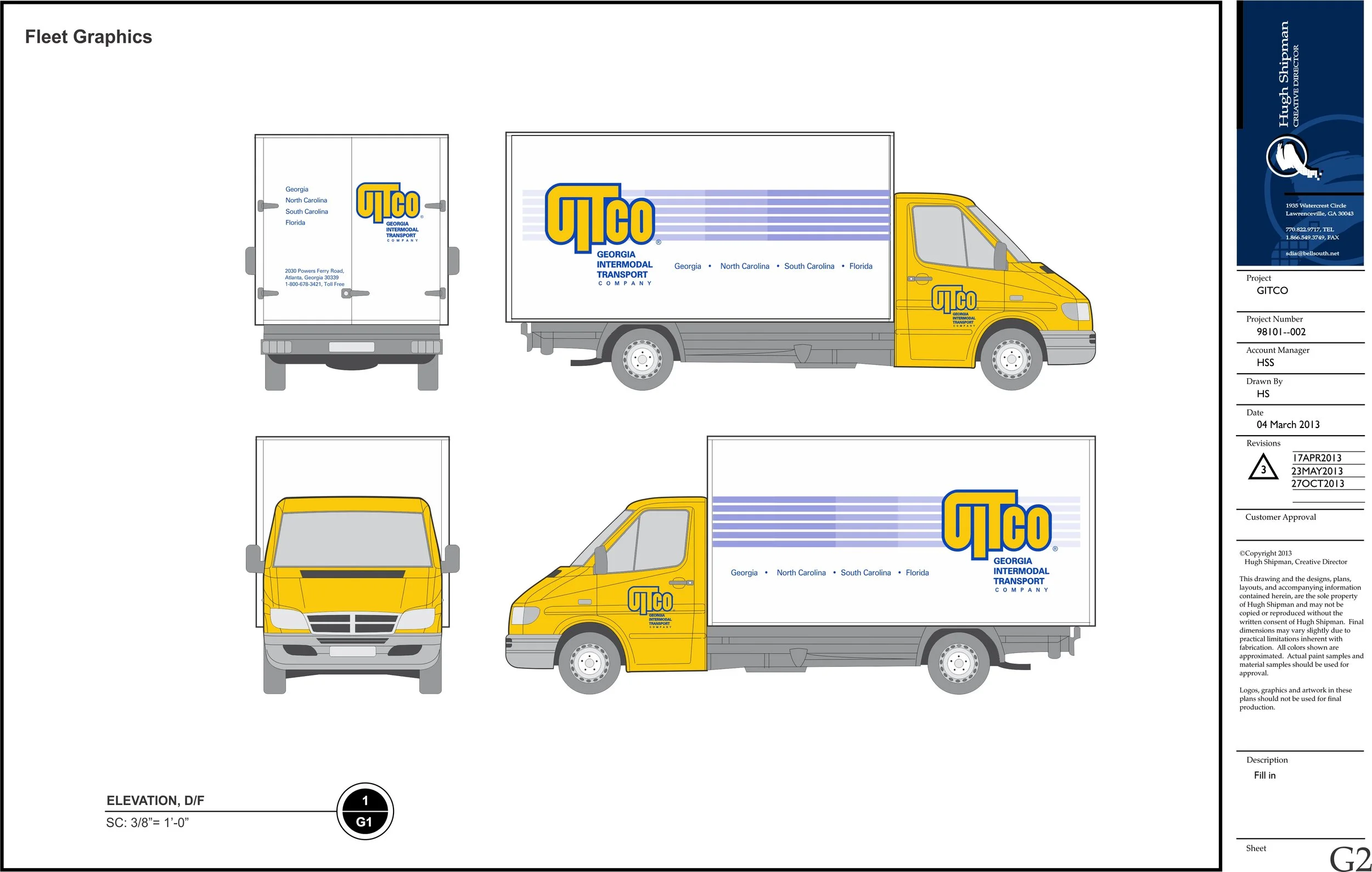
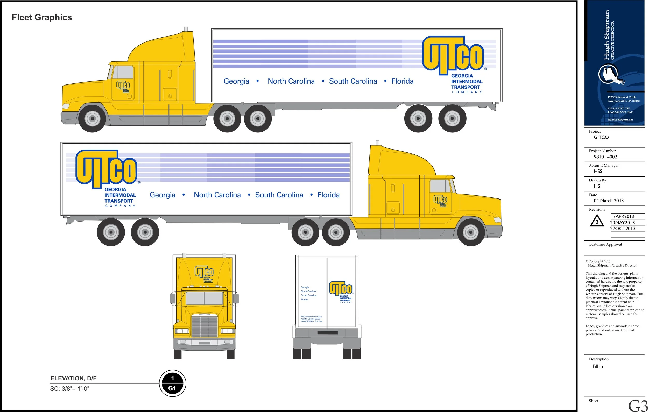
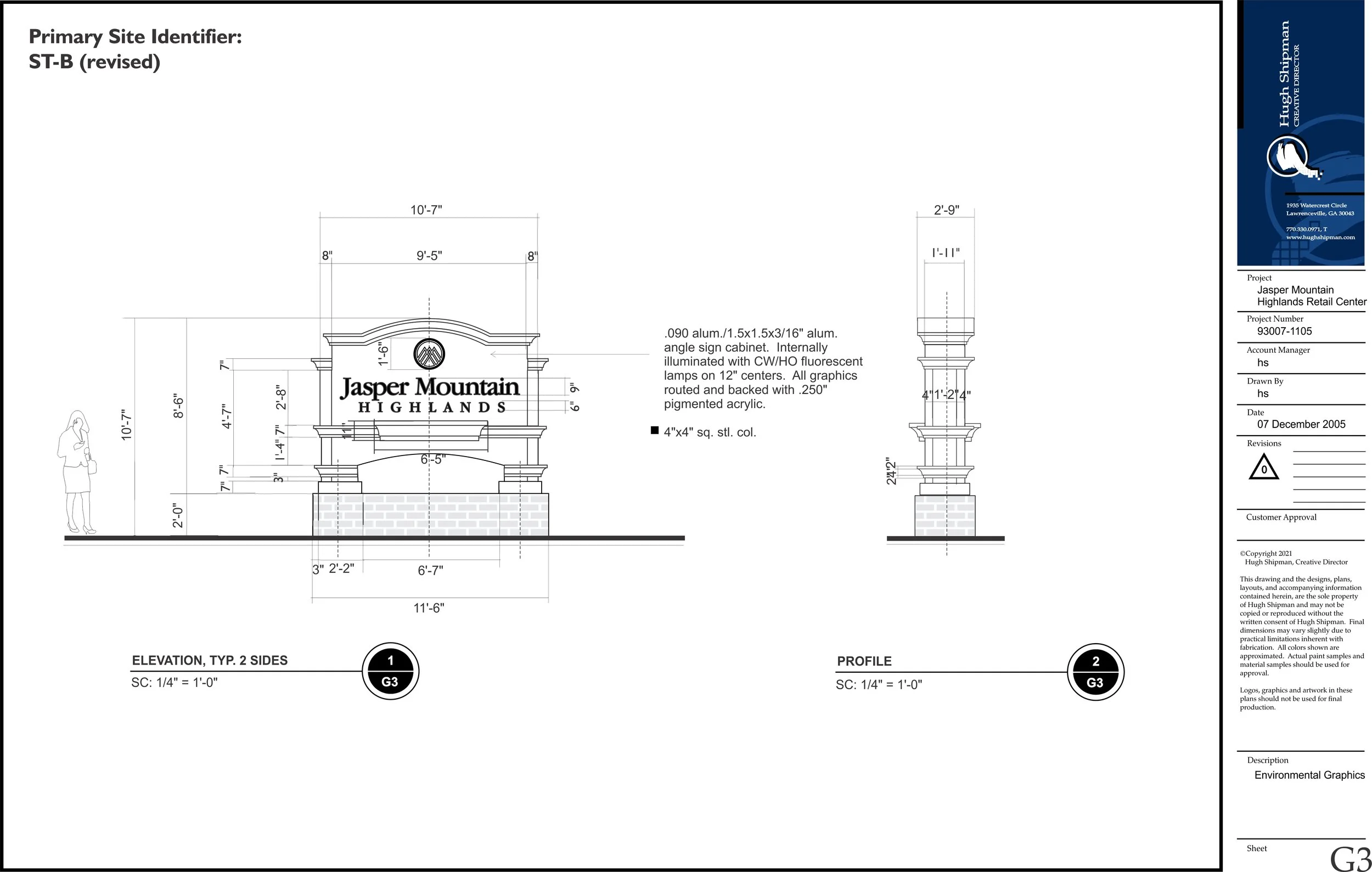
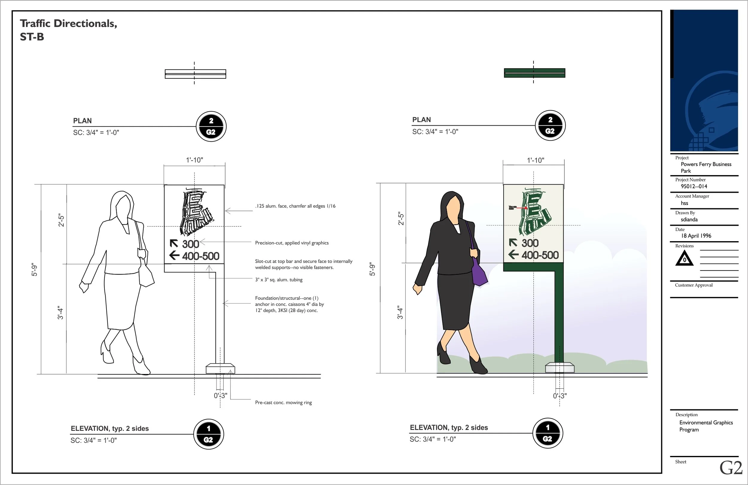
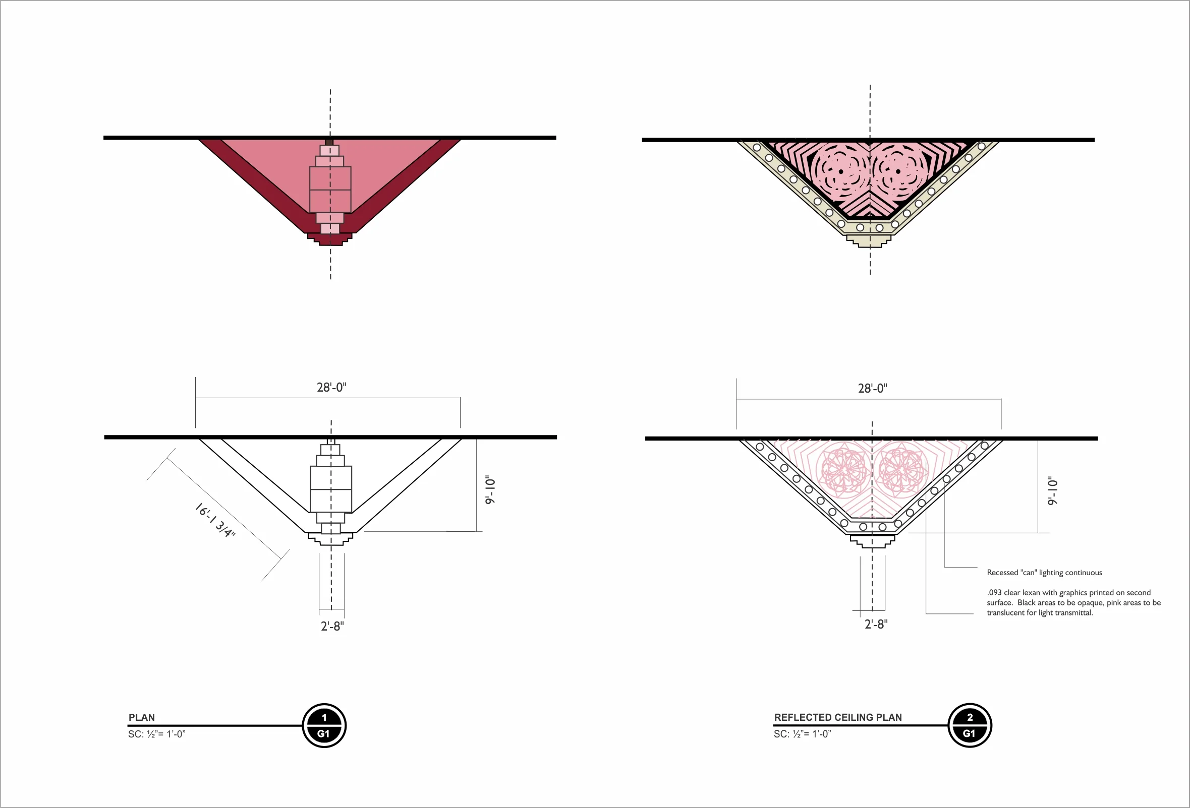
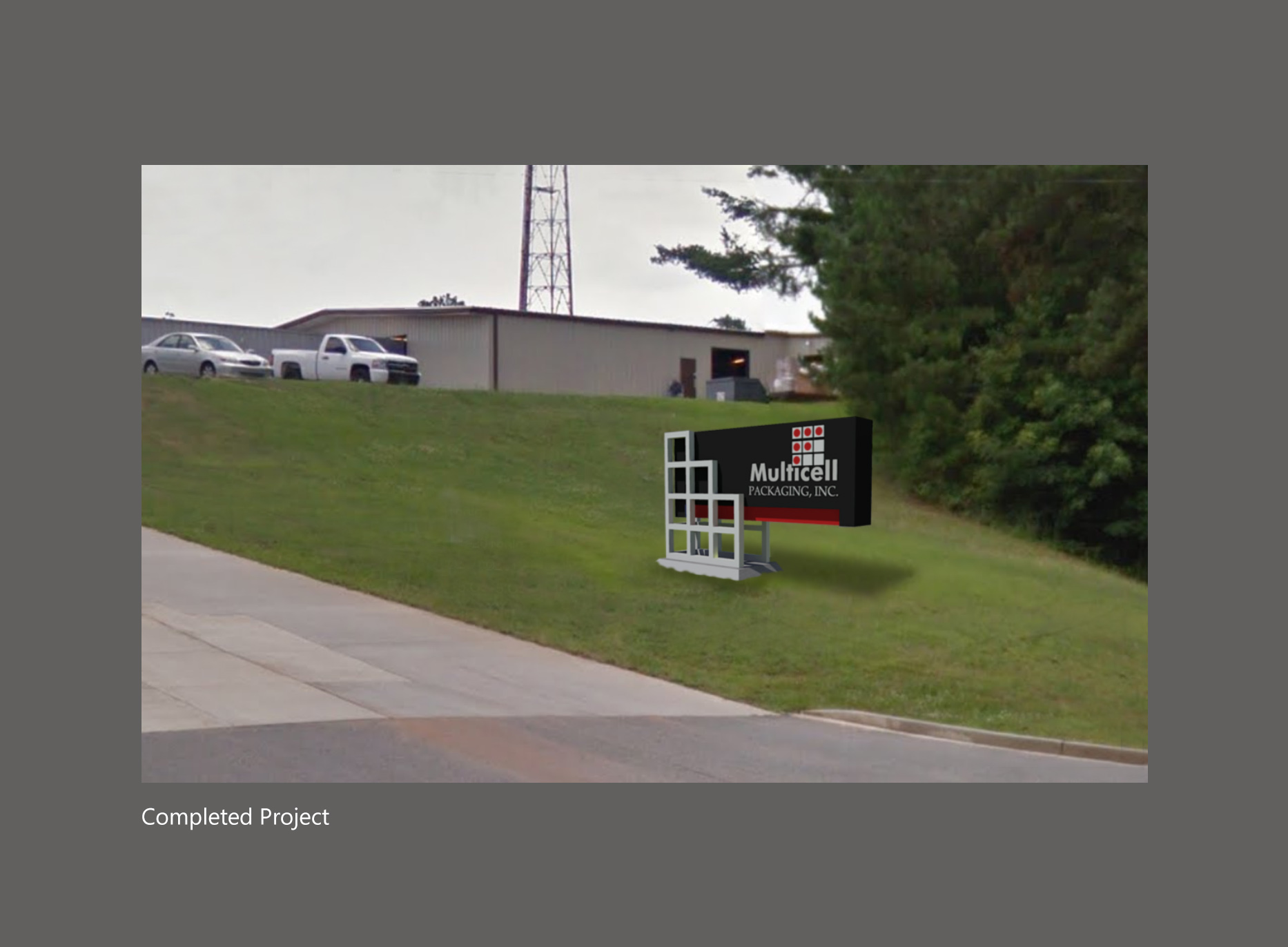
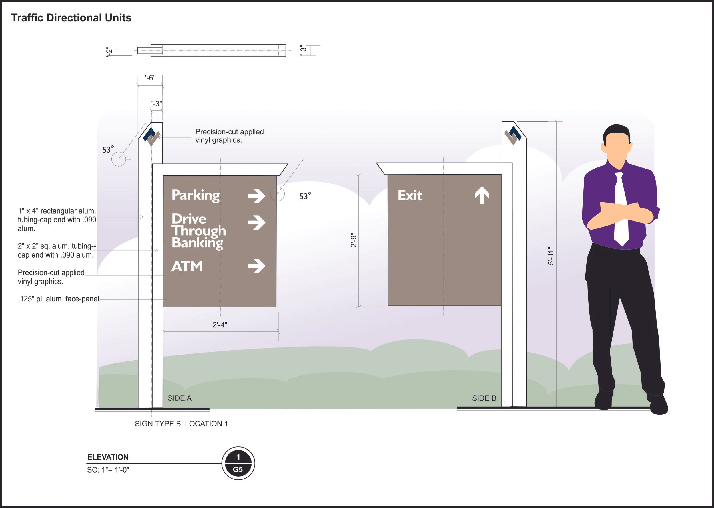
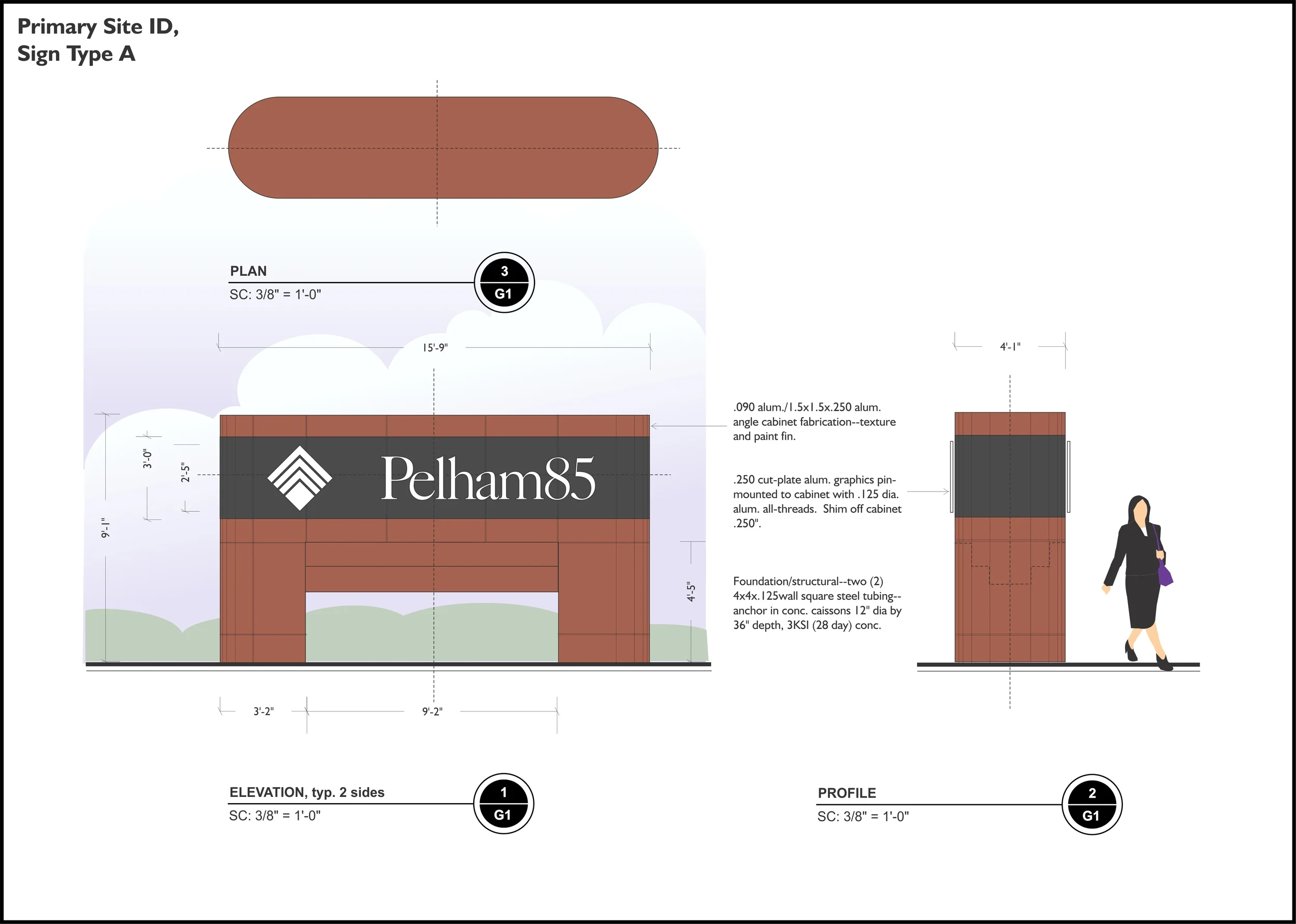
Once an identity is born, a fairly rigid (but flexible) set of rules are established for its use application.  Production art is created for printers, sign companies and anyone else involved with using the logo.  Nothing is left to chance or rogue interpretation.

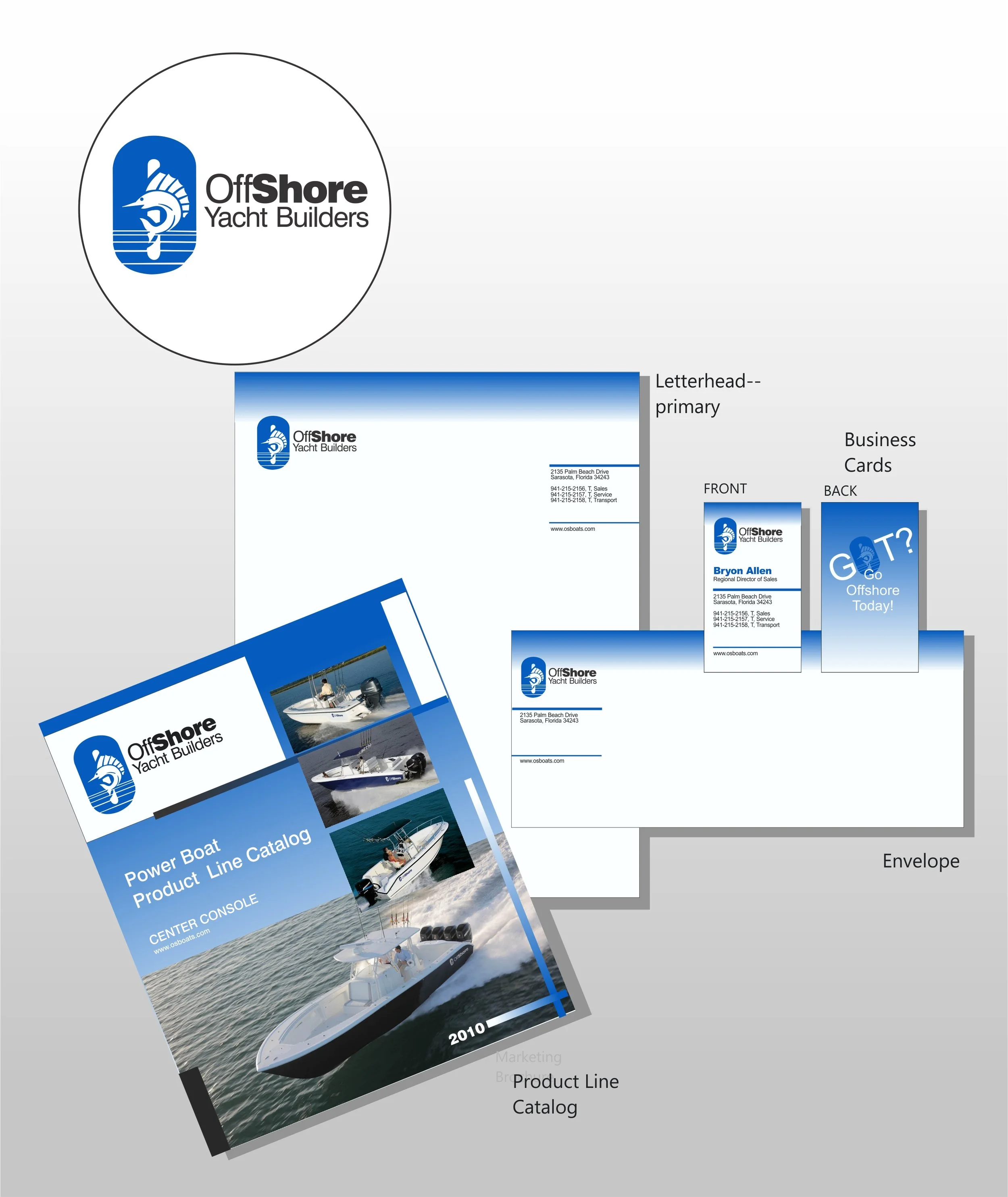
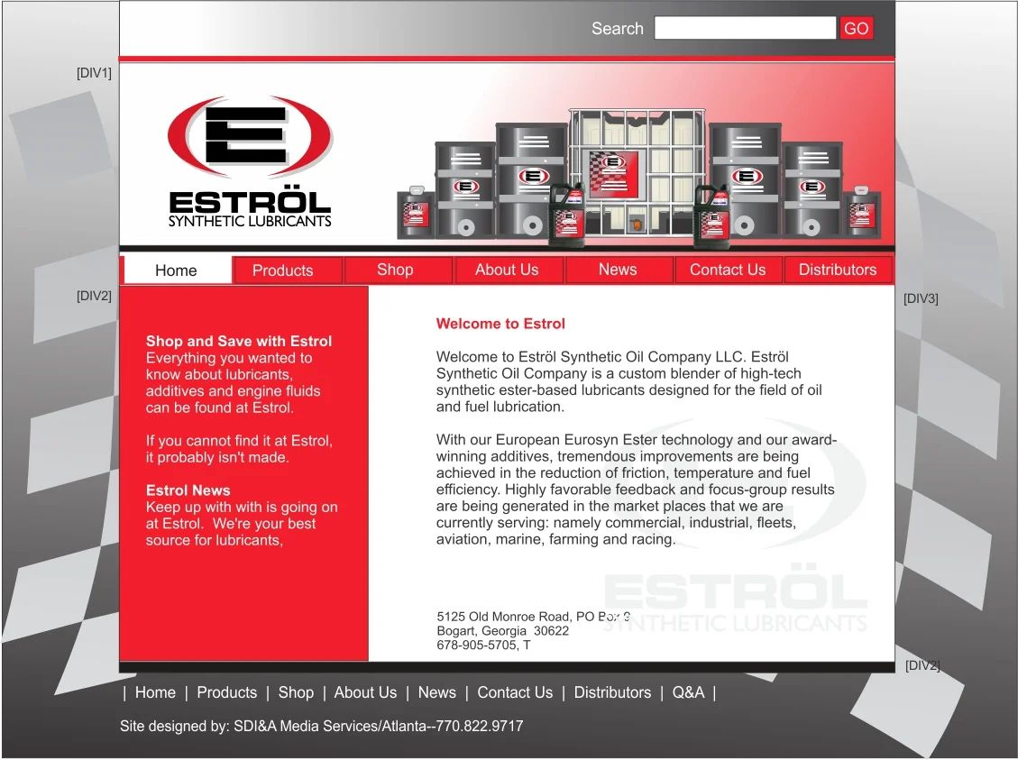
I have logos still in use out there standing the test of time, Chestnut Mountain and OffShore Yacht Builders are examples.  Both are still in use without any need for revising, updating or modernizing.

Chestnut Mountain Winery

After completing the identity, next up was the collateral, signage, labels and marketing materials.

Offshore Yacht Builders

Offshore, a well-recognized brand in the industry sees the brand in a clean, consistent manner in print and product.

Oak Meadow Montessori School, Lawrenceville

OMMS does an excellent job of keeping the brand clean and fresh. From signage, to print, to everyday t-shirts, the OMMS colors are never muddied, misused or mixed with anything else inconsistent with their image.

Oak Meadow 3--photo 1.JPG
Miller Log Home and Timberframe Construction

After designing the identity, next up was the collateral program.

Miller Log Homes and Timberframe Construction

9x12 pocket folder containing marketing DVD

Southlife Homes
Southlife Homes
Lawrenceville Assistance Project

Lawrenceville Assistance Project, a program that repairs the homes of people and families in need at no cost.

LAP--MP Room Presentation 1--2024

A LAP presentation given in the churches multipurpose room from the AV booth. I manage the AV services at the church.

Rivers Edge Mountain Community

Logo, collateral and signage systems were designed for this project.

Homestead Inns
Homestead Inns

Homestead Inn is a franchise operation with locations in Georgia, Alabama and Mississippi.

Corporate identity was applied to forms, collateral, marketing and signage.

Bayhouse Inn
Bayhouse Inn
Adopt-a-Park 2.jpg
Adopt-a-Park 2.jpg
Parkwatch 2.jpg
Parkwatch 2.jpg
Gwinnett County Parks & Recreation: The 5K Race
OCAF: Oconee Cultural Arts Foundation
Multicell Packaging
Multicell Packaging

A packaging company in Lawrenceville, specializing in interpackaging dividers and separators which was, of course, the inspiration for the logo.

TGS Media
TGS Media

TGS Media is a company that specializes in publication distribution, specifically print media that is open-source and/or free in nature.  Over time, TGS began to design and publish its own magazines, one of which, Builders Resource Magazine was one that I was the designer and producer of digital pre-press materials.

Estrol Brands: Cody Bison Snack Products
Estrol Brands: Bulldog Energy Drinks
Estrol, Inc.
Estrol, Inc.
MVM, Most Valuable Member Card Services

Designing the identity graphics for a credit card service was exciting.  Over fifty different logo designs were proposed before settling upon one of the earlier designs which was, in my mind, a good choice, but I had my heart set on one of the other ideas proposed.  Oh well.

Pike County Development Authority

PCDA works closely with private corporations to bring business opportunities and jobs to Pike County. This identity program may be expanded to all of Pike County Government.

SNB: Security National Bank
Ideal Signs
Ideal Signs
First Bank of Pike--2018

First Bank of Pike, founded 1901, needed a fresh, updated look. The logo, symbolic of how the bank with four locations is interwoven into the community in many ways. The two-color identity was applied to signage, ATM systems, print collateral, credit cards, website and more.

Spivey State Bank
Spivey State Bank

The inspiration for this came from some old architectural details at the bank's older location. It seemed perfect because it symbolized the history of the bank in its community. The identity has been applied to collateral, signage and marketing.

The original design for the signs had the logo against a white background.  The decision to reverse it was somewhat last-minute because it was decided that the new corporate color needed to play an equal role in the new design.

The Village USA
The Village USA

A 503(c) non-profit that works with foster children.

Media Graphix Lithographers

It was fun designing a logo for someone 'in the business'.  The entire program uses just two spot colors and the spot varnish coat that targeted just the identity elements really made it pop off the page.

Lancer Laboratories
Lancer Laboratories
TPark Films
TPark Films
United Sign Advertising
Financial Contract Services

9x12 Pocket (Project) Folder

Chalmers Concepts Corporation
SDI & Associates
SDI & Associates

My own design firm’s collateral program, SDI & Associates. I designed this in 1992 and it essentially remained unchanged to today.

JBP & Associates
JBP & Associates

A design agency I worked for before starting my own agency. I designed their logo, up-front collateral systems, marketing and signage.

A Few More Logos 1--2023.jpg
A Few More Logos 2--2023.jpg
A Few More Logos 3--2023.jpg

Portfolio 4: Signage / Environmental Graphics

Member: SEGD, The Society of Environmental Graphic Designers

The field of signage and environmental graphics should logically be an extension of the corporation's identity, branding and color pallet.  That said, it should accomplish additional tasks that go beyond the other parts of a corporate collateral program. 

A good signage system should wayfind and help direct pedestrian and vehicular traffic as well as complement the surrounding architecture.  Signage should be practical, easy to update or replace and maintain.

Jasper Mountain Highlands PSI--2006 0.jpg

Signage location plan.

Jasper Mountain Highlands PSI--2006 2.jpg

Elevations for Sign Type A

Jasper Mountain Highlands PSI--2006 3.jpg

Elevations for Sign Type A.

Jasper Mountain Highlands PSI--2006 4.jpg

Elevations for Sign Type B.

Jasper Mountain Highlands PSI--2006 5.jpg

Elevations for Sign Type B.

Jasper Mountain Highlands PSI--2006 1.JPG

Completed project photo.

Powers Ferry Business Park

General site map detailing locations of signage. A process of wayfinding is shown.

Powers Ferry Business Park

CAD and orthographic elevations—main sign

Powers Ferry Business Park

CAD and orthographic elevations—main sign

Powers Ferry Business Park

CAD and orthographic elevations—traffic directional

Powers Ferry Business Park

CAD and orthographic elevations—tenant directory

Powers Ferry Business Park

Park Identity—used on signage and marketing

Powers Ferry Business Park

ST-A—3D view of main sign

Powers Ferry Business Park

3D night view of main sign showing illuminated elements.

Powers Ferry Business Park

Completed project.

McIntosh State Bank
McIntosh State Bank

My first task with McIntosh State Bank was to develop an identity program for the bank as well as for the financial services consulting division.  I picked a mid-range blue because blue is often cited as a perceived service color.

McIntosh State Bank
McIntosh State Bank

The bank had several branches at the time of the image renovation, and an expansion was planned, so I developed a range of sizes that would take into account jurisdictional requirements.

McIntosh State Bank
McIntosh State Bank

Color rendering of Primary Sign System.

McIntosh State Bank
McIntosh State Bank

3D Rendering of typical branch to visualize the new identity.

McIntosh State Bank
McIntosh State Bank

3D rendering Night view of typical branch.

McIntosh State Bank
McIntosh State Bank

Completed project--this is the Jackson, Georgia branch office.

Rose Theater, Forsyth, Georgia

Signage and facade renovation.  For this assignment, I was tasked with first developing an identity for this theater located in Forsyth, Georgia. 

The marquee and vertical sign are all aluminum fabrication and the graphics are classic exposed neon.

Rose Theater, Forsyth, Georgia

Top view and reflected ceiling plan.  The ceiling is a complex set of channel graphics outlined in rose-color and white-color 13mm neon.

Rose Theater, Forsyth, Georgia

3D street view of signage system.

Rose Theater, Forsyth, Georgia

3D street view of signage, proposed banners and facade.

Rose Theater, Forsyth, Georgia

Fly-in view of structure.  A new dryvit/EFIS finish was applied to the entire front giving a fresh, new appearance.

Rose Theater, Forsyth, Georgia

Interior view from A/V control booth toward stage.  

Rose Theater, Forsyth, Georgia

Interior view toward main entrance with view of control room above.

Rose Theater, Forsyth Georgia

3D night view of signage and facade.

Rose Theater, Forsyth, Georgia

Completed project.

Rose Theater, Forsyth County

Lovely nighttime view of the facade. Local residents’ as well as local businesses’ opinion of the new signage has been overwhelmingly positive and the theater has managed to gain a lot of free press time because of the new image.

Multicell Packaging
Multicell Packaging

When I was drafting out the rough concepts for this sign, I wanted something that played on the distinctive logo I designed.  The red bar at the bottom is illuminated by internal high-output LED lamps.  The sign is standard aluminum sheet and angle fabrication.  The white grid is 2x4 alum tubing which also doubles as the structural support.

Multicell Packaging
Multicell Packaging

3D model of the sign used for both communicating the design to the client as well as the fabricator, Moriah Signs.

Multicell Packaging, Inc.

3D view.

Multicell Packaging, Inc.

3D view.

Multicell Packaging
Multicell Packaging

Completed project.

Peachtree Ridge Office Tower

Color view of main sign.

Peachtree Ridge Office Tower

Structural notes for main sign showing internal re-bar elements and tie-in to foundation.

Peachtree Ridge Office Tower

Color view of secondary site sign.

Peachtree Ridge Office Tower

Color view of traffic directional signage.

Peachtree Ridge Office Tower

3D view of main sign and entrance to facility.

Peachtree Ridge Office Tower

3D view, forward facing end of sign.

Peachtree Ridge Office Tower

Expanded 3D view of site and relative position of signage.

Peachtree Ridge Office Tower

Typical traffic directional sign unit.

Peachtree Ridge Office Tower

Fly in view.

Peachtree Ridge
Peachtree Ridge

Photo of completed project.

American Century Banking Corp

Primary Site Identifier with electronic message center.

American Century Banking Corp

Primary Site Identifier--fabrication notes.

American Century Banking Corp

Traffic Directional Units

American Century Banking Corp

Full property showing all signage elements.

American Century Banking Corp

3D view of main sign.

American Century Bank

3D view of main sign.

American Century Bank

Night view of main sign. The initial idea was to route and backlight the logo, however, it was thought that would be weak at night, so we decided to ground light instead. Careful attention was given to not washing out the LED electronic display.

American Century Bank

3D view of typical traffic directional sign.

American Century Bank

Completed project photograph--Georgia Hwy 42 McDonough Branch

Homestead Inn
Homestead Inn

Color view of main sign.

Homestead Inn
Homestead Inn

Color view of building-mount signage elements.

Homestead Inn
Homestead Inn

Marketing and construction signage.  Not willing to leave to chance, Homestead Inn has pre-designed signage to be used in the pre and during construction phases.  I worked with two approved vendors to ensure adherence to production and corporate identity standards.

Homestead Inn
Homestead Inn

Signage and structures.

Homestead Inn
Homestead Inn

Building-mount signage.

Homestead Inn
Homestead Inn

Completed project--Ballground, Georgia

Pelham 85 Office Park, SC

Color view of main signs.

Pelham 85 Office Park, SC

Color view of secondary main sign.

Pelham 85 Office Park

3D views of signage.

Pelham 85 Office Park, SC

3D view of main sign

Pelham 85 Office Park, SC

Site signature sculpture.  At the intersection corner of the property, the client wished to have something unique.  I came up with this.

Pelham 85 Office Park, SC

Traffic directional signage.

Pelham 85 Office Park, SC

Photos of completed project.

Spivey State Bank
Spivey State Bank

After I completed designing the identity for the bank, signage and print collateral was up next.  It was important to showcase not only the new identity, but the new corporate colors, so the decision was made to reverse out the graphics and utilize custom-printed vinyl allowing for a clean, backlighted design.

Spivey State Bank
Spivey State Bank

3D day view of signage and architecture.

Spivey State Bank
Spivey State Bank

3D night view of signage and architecture.

Spivey State Bank
Spivey State Bank

Completed project photo of Swainsboro Georgia Branch.  Shown are the main sign, building-mount graphics and the ATM canopy structure.

Porfolio 5: CPG Packaging

Experience with CPG (Consumer Packaged Goods)

Packaging involves the same disciplines as print, but with the added aspects of three dimensionality, product requirements and unique press applications such as printing on glass, printing on plastic, silk screen, flexography, UPC product codes and controlled varnishes.  I have had the privilege of working on everything from wine bottles to shampoo lines to durable goods.

Each example shown is also an example of identity design. The logos used were also designed by me and were the first step before engaging in the packaging work. Seen as an extension of packaging, the logo ensures stronger connections to other facets of marketing, print, signage and improved market retention.

Hunter Apiaries
Hunter Apiaries

A great deal of focus was placed on the identity first. The logo would take priority on the labels, signage, gift boxes, website, etc. The client was quite pleased with the results.

Toucan Tropical--Island Gel

This assignment began with designing the identity which I always work to make the most prominent element of any packaging project. Other product labels for Toucan Tropical include posterized illustrations of beach scenes.

Toucan Tropical--Island Creme

Again, the use of the identity is prominent just above the product name. The posterized scene is used heavily in marketing and advertising. The reverse label is one color to reduce costs.

Chestnut Mountain--bottle with glass RED

This is number one in a series of three labels for Chestnut Mountain Winery. The three colors aided in the delineation of the vintages made. I rendered the watercolor of the building specifically for the labels.

Chestnut Mountain Winery--bottle with glass GREEN
Chestnut Mountain Winery--bottle with glass BLUE
Bullet Bobs Hunter Products

Created by Nature Clean, the Bullet Bob product lines are unified by a consistent use of the camo-orange backgrounds and a bold use of the new logo I designed.  The client gave me an old, blurry photograph to use in order to design the logo. The logo and the name originated from the father of the company's owner who was an avid deer hunter and helped to develop the formulas used in the scent control product line.

Bullet Bobs Hunter Products

Enclosure box for the product line.  To make the digital pre-press production files, the packaging printer sent me a PDF cut-line drawing which I then did my art on top of.  Instead of CMYK, we actually designed the box as a six-color, spot format.

Estrol Synthetic Lubricants

In addition to completing Estrol's new identity, collateral, website, exhibit and marketing, I also designed the new packaging for their product lines.  Their line of synthetic oils, used by formula one racers, is their flagship line.

Big Johns Vehicle Cleaner

Developed and marketed by Nature Clean, I first designed the logo. I then designed the packaging to be visually clear through the use of infographics. Identity is designed for the full range of 32oz. dispenser bottles on up to 55 gallon drums, though at first it was only applied to retail bottles.

Roush Performance Product Line

Working in partnership with Nature Clean, Roush wanted a make-over of its automotive products line that was both bold and fresh.  The use of reds, blacks and greys was a logical extension of the existing corporate identity.  All new packaging and bottle shapes were also used. Nature Clean did the original photo of this grouping. I replaced the background.

Captain Foaminator and Miss Foaminator

Produced, marketed and sold by NHS, the Foaminator line of facial and hand soaps are targeted specifically at either boys or girls.   The name Miss Foaminator was decided upon by the client.  My choice was to use something kids would relate to such as Fabulous Farrah Foaminator.  Transformers were popular with kids when I designed the graphics. When the product is emitted, it automatically expands into a blue or pink foam.  It's actually quite cool.

Bact-o-Ban
Bact-o-Ban

The Bact-o-Ban deodorant product line is a true deviation from the traditional antiperspirant deodorants that use a wide range of chemicals. I designed Bact-o-Ban's packaging to show how, at the microbial level, treats the bacteria that actually cause odor.  It uses a mix of natural ingredients instead of aluminum salts which other deodorants use which are deemed harmful.

Cody Bison Snack and Energy Products

Produced and marketed under the Estrol Brand, all of the Cody Bison products, with the exception of the power drinks, use buffalo meat in their ingredient lists.  When I developed the graphics, I went for a bold, liberal use of hot colors contrasted with a stark black gave the punch the client was seeking.  The tattoo-style graphics have a reach with the suggested demographics

Portfolio 6: Print / Publishing

In this age of digital, the printed page still holds importance in the corporate communications toolbox.  From letterhead to brochure and all in between, the corporation's identity needs to be applied with forethought and impact on the entire business image.

Consideration should also be given to ease of use, reordering and how the materials will be used on a daily basis.

All materials should be carefully planned and digital pre-press files which will be sent to outside contractors for production, need to be thorough and complete.

Gwinnett Parks & Recreation Guide--EXTERIOR

Exterior: four-color gate-fold. Master Rental Guide for all parks facilities in Gwinnett County.

Gwinnett County Parks & Recreation Guide--INTERIOR

Interior: Four-color match-up of Gwinnett County Parks facilities rental guide.

Gwinnett County Parks & Recreation Enclosing Folder

Hand-out Folder--various applications and uses.  Four-color process on #10 matte finish card stock with a matte varnish over.

PARKWATCH MARKETING BROCHURE--EXTERIOR.jpg
PARKWATCH MARKETING BROCHURE--INTERIOR.jpg
Gwinnett County Courthouse Guest Brochure--Exterior

Exterior side, four-color, gate-fold brochure for Gwinnett Country Courthouse.  The intent of the brochure is to provide anyone inquiring about the facilities a full overview of what is available.  And while that same information is available online at the county's website, it is felt that a hand-out physical handout actually communicates more effectively.  The handout also directs visitors to the online information.
 

Gwinnett County Courthouse Guest Brochure--Interior

Interior spread, four-color gate-fold brochure.  The old courthouse hosts a large number of wedding receptions every year.  The floorplans and overall site plan are useful toward the planning process.

LAP - Lawrenceville Assistance Project Brochure Exterior

Front/Back exterior spread. After designing both the LAP logo as well as the logo for the church, I designed a general brochure. LAP is a youth-oriented community assistance program that aids people with yard and home maintenance projects.

Interior spread. LAP - Lawrenceville Assistance Project General Brochure
LAP - Lawrenceville Assistance Project Brochure Exterior

Each year, a new ‘year event logo’ is created along with a marketing brochure and sign-up form.

LAP - Lawrenceville Assistance Project Brochure Interior
Multicell--CORPORATE MARKETING BROCHURE--EXTERIOR

11”x22” tri-fold brochure with tear-off for rolodex card and mail-in. The cover photo was done using the product on red and blue gels backlighted. The sign on the back is my design.

Multicell--CORPORATE MARKETING BROCHURE--INTERIOR

11”x22” tri-fold brochure. All photographs were done in-house. The idea was to show actual products shown on top of the dividers. Overall, we wanted a design that was vibrant and energetic.

Multicell--A.jpg
Multicell--A.jpg
Multicell Packaging Advertisement Series

Series of quarter page advertisements for Packaging World Magazine. For effect, and in keeping with the company's image, I decided to use duotone images paired with black backgrounds and reversed text.

Multicell Packaging Marketing Brochure

Parallel folding brochure. Multicell Packaging is a client I did everything for--from signage, to print, to advertising--even exhibits.  This is the exterior side of a four-color CMYK gate-fold brochure.  The exterior is the playful side that references the die-cut nature of their interpackaging product lines.

Multicell Packaging Marketing Brochure

Parallel folding brochure. When the brochure is opened, the first two panels seen is this.  The die-cut nature of their product lines lent itself well to the play on meanings and metaphors.  The two panels then open out to reveal what Multicell is and does.

The red half-circles are a clear reference to the company logo.

Multicell Packaging Marketing Brochure

Parallel folding brochure---interior panels. The full spread interior shows both the chipboard and the corrugated product lines and an exploration of the ordering process.  References to the website and the online ordering methods are made throughout the brochure.

Multicell--10 YEAR ANNOUNCEMENT 1

An invitation mailer for Multicell’s 10 year anniversary. Designed as a tri-fold to be inserted into envelope and combined with RSVP and map. The 10 year logo was included with the design and was used on other fulfillment items.

IBP-1A.jpg
IBP Internet Seminars

Tri-fold targeted direct mailer for IBP Internet Seminars—part of a series of similar design mailer pieces that coordinated with online email marketing and on-location signage.

Corporate Effects Advertisement 1.jpg
Media Graphix Lithographers Marketing Brochure--Exterior

After designing their logo and collateral systems, I then crafted a marketing brochure.  The final trim size is 8x10, single score and fold.  It is designed as a handout (leave-behind) for the sales staff and as an insert into a 9x12 envelope and paired with transient pricing sheets and customized cover letter.

Media Graphix Lithographers Marketing Brochure--Interior

After designing their logo and collateral systems, I then crafted a marketing brochure.  The final trim size is 8x10, single score and fold.  It is designed as a handout (leave-behind) for the sales staff and as an insert into a 9x12 envelope and paired with transient pricing sheets and customized cover letter.

I also designed a series of custom graphics that were oversized printed as hanging signage inside the plant which would be familiar guideposts for visitors.

Chestnut Mountain Winery

Some might say that billboard, or out-of-house, is not print.  My opinion differs.  When I worked at Turner Outdoor, the process of designing, production art and final implementation exactly matched that of print processes.

This 14x48 rotational billboard for Chestnut Mountain first did rotational on I-85.  I designed this after completing their logo, collateral, print, signage and packaging.

Penrod's Cafe
Penrod's Cafe

This has to be one of my most favorite billboards.  This 14x48 rotational has cut-outs (or extensions) on all three sides.  I came up with a series of billboards using their parrot mascot.  The other designs use early 1920s motifs because that is used heavily at the restaurant.

Sportsmanship In Gwinnett - Parks and Recreation

Exterior front and back of invitation - 3-spot color format..

Sportmanship in Gwinnett - Parks and Recreation

Interior spread of invitation - 3-spot color format

GWINNETT LIFE SELF AD 1

One of a series of grayscale ads promoting the publication Gwinnett LIFE to potential advertisers. This ad layout was also used in direct mailers and website.

Gwinnett L.I.F.E. Quarterly Magazine--Cover

Gwinnett LIFE is a quarterly, 60-page, publication and is distributed to all residents of Gwinnett County.  The primary purpose of the publication is to inform citizens about the availability of educational classes such as computer training, tennis programs, etc.  The publication is printed on a 4 over 2 web press and is printed on high-white opacity newsprint.

The reason for the upside down side for the community schools is simply tradition.  The final 20 or so pages are given over to the specialized classes offered within the public school system, and to differentiate that section, the county came up with the upside down idea.

Gwinnett L.I.F.E.
Gwinnett L.I.F.E.

Sample page from the publication.  The entire publication is assembled in QuarkXpress. The primary body font is Rotis Demi and Rotis Bold. I've used Rotis for years and I love how it looks on the printed page. Helvetica is primarily used as the headline 1 and headline 2 font.

Gwinnett L.I.F.E.
Gwinnett L.I.F.E.

Sample page from the publication.

Gwinnett L.I.F.E.
Gwinnett L.I.F.E.

Sample page from the publication.

Gwinnett L.I.F.E.
Gwinnett L.I.F.E.

Sample page from the publication.

Gwinnett L.I.F.E.
Gwinnett L.I.F.E.

Sample page from the publication.

Gwinnett Corporate Challenge

Exterior for the 2-color tri-fold brochure for the Gwinnett Corporate Challenge which is a multi-sport county-wide competition.  Entrants (corporations) can sign up for one or multiple sporting events and winners are awarded medals similar to the ones shown on the brochure.

Gwinnett Corporate Challenge

Interior spread for the 2-color marketing sign-up brochure.

Gwinnett Corporate Challege

Cover design for the handbook outlining the procedures and rules for the challenge.
 

Gwinnett Corporate Challenge

2-color silk-screen t-shirt design.

Chalmers Concepts Services Brochure--Exterior

Oversized gate-fold marketing brochure--final trim size, 11" x 34".  On the exterior, the company's services are explained.  On the interior spread is shown sample photos of projects Chalmers has done.  The cover photo is a photoshop composite of several photographs I shot while at their manufacturing plant in Hapeville, Georgia.

Chalmers Concepts Services Brochure--Interior

Oversized gate-fold marketing brochure--final trim size: 11" x 34".  On the exterior, the company's services are explained.  On the interior spread is shown sample photos of projects Chalmers has done.

Chalmers Concepts Corporation--Focus Handout--FRONT

Chalmers, in addition to manufacturing signage, also designs, manufactures and installs ATM systems.  This is the front side of a letter-sized brochure that emphasizes maintenance of ATM programs. It is routinely mailed out in a 9x12 marketing envelope with a cover letter and pricing sheets.

Chalmers Concepts Corporation--Focus Handout--BACK

Reverse side of ATM Focus Sheet which highlights the "Chalmers Building"--a construct for a freestanding ATM program.
 

Portfolio 7: Facility Design / Space Planning

For anyone involved in environmental graphic design, facility design and space planning eventually enter into the portfolio mix.  I have been blessed to have opportunities such as Mr. Ching, a Chinese fast food drive-through concept, Chalmers Concepts, for whom I designed their entire building, Dominos Pizzazz, a dine-in concept, and RIO, a specialty mall.

Mr Ching Chinese Drive Thru--Prototype

Exterior elevations for structure and logo applied.  Designed for Turnkey Properties, I designed the full concept which included full orthographic plans for structure, electrical, plumbing, kitchen fixtures and front end.  Final CAD plans included all signage, site and site lighting plan.

3D Model--Mr Ching Chinese Drive-Thru--Prototype

Full exterior 3D view of building, signage and site.  Designed for Turnkey Properties, I designed the full concept which included full plans for structure, electrical, plumbing, kitchen fixtures and front end.  Final CAD plans included all signage, site and site lighting plan.

3D Model--Mr Ching Chinese Drive Thru--Prototype

3D views, East and South views of structure and site.

3D Model--Mr Ching Chinese Drive Thru--Prototype

Night view of site and structure.

3D Model--Mr Ching Chinese Drive Thru--Prototype

Plan Section View at canopy line.

3D Model--Mr Ching Chinese Drive Thru--Prototype

East Elevation Sectional View--longitudinal array showing both front and kitchen prep.

3D Model--Mr Ching Chinese Drive-Thru--Prototype

Interior view of customer counter and menu system.

3D Model--Mr Ching Chinese Drive-Thru--Prototype

Interior view of customer service counter and menu system.

3D Model--Mr Ching Chinese Drive-Thru--Prototype

Interior view from kitchen toward front customer area.

3D Model--Mr Ching Chinese Drive-Thru--Prototype

Interior view of kitchen and prep.  The entire facility was planned out in 3D mode which permitted good visualization of all elements and areas.

Mr Ching
Mr Ching

Completed prototype location.

Chalmers Concepts Corporation, Canton, Georgia

For Chalmers, I designed their new location in Canton, Georgia.  From the initial plan meetings, to rough sketches on to CAD drawings that included framing notes, HVAC systems, electrical, plumbing, and computer network wiring, the program was thorough and complete.

Chalmers Concepts Corporation, Canton, Georgia

Enlargement of the offices, designation floorplans.

Chalmers Concepts Corporation, Canton, Georgia

Electrical, plumbing, data and HVAC plans.

Chalmers Concepts Corporation, Canton, Georgia

Once the basic CAD drawings were complete, it was time to translate them into full 3D environments.  Pictured here is the structure with site, parking, signage, etc.

Chalmers Concepts Corporation, Canton, Georgia

Plan Section View--interior and site.
 

Chalmers Concepts Corporation, Canton, Georgia

Plan Section View--close in of reception and meeting section of floor plan.

Chalmers Concepts Corporation, Canton, Georgia

Elevation Sectional View--west toward reception and meeting room.

Chalmers Concepts Corporation, Canton, Georgia

Front reception area.

Chalmers Concepts Corporation, Canton, Georgia

Conference and client presentation room.

Chalmers Concepts Corporation
Master Kleen
Master Kleen

After completing Master Kleen's new identity program, I launched into the design retrofit application of new signage and front customer service bay.  Plans included all finish details, counters, interior signage and exterior signage.  The rollout for all 14 locations was completed in 6 weeks.

Master Kleen
Master Kleen

Plan Section View with focus on customer service bay.
 

Master Kleen
Master Kleen

Full view of structure and site--night.

Master Kleen
Master Kleen

Expanded rendering.

Dominos Pizzazz Prototype Restaurant

Dominos Pizza has been interested in developing a full-scale dine-in restaurant which would offer a greatly expanded menu.  I was provided a criteria list that included the recommended footprint and square footage planned for each part of the facility.  The plans provided needed to be complete--structural, engineering, electrical, data, plumbing.

Color page from CAD and engineering package.


Dominos Pizzazz Prototype Restaurant

Eye-level customer experience angle.

Dominos Pizzazz Prototype Restaurant

Eye-level rendering of facility.

Dominos Pizzazz Prototype Restaurant

Street front view.

Dominos Pizzazz Prototype Restaurant

Plan Sectional View showing ceiling treatments in dining area.  The geodesic approach gave the space an unusual visual treatment not seen in a fast food environment.  At first, it was suggested that lighting be incorporated into the truss-work, but I suggested that it would be cozier to have drop-down pendants instead.

Dominos Pizzazz Prototype Restaurant

Plan Sectional View of the dining room and all fixtures.  The two circular buffet bars with colored glass sneeze guards and ceiling treatments.  The first bar is for pizza and pasta.  The second bar is for salad.

Dominos Pizzazz Prototype Restaurant

Lateral Plan View of dining room showing relative positions of all ceiling treatments.

Dominos Pizzazz Prototype Restaurant

Interior view toward ordering counter.  Hanging pendant lighting is used in conjunction with directed track lighting.

Dominos Pizzazz Prototype Restaurant

Interior view from side entry toward dining room.  Even with the overhead skylights, the interior is warm and not overly bright.  The use of darker neutrals on the walls helps with this. The pendant lighting adds a sense of privacy to the space.  Similar to Pizza Hut, real plates and silverware are used, so there are no waste disposal bins.

FNB of Polk County
FNB of Polk County

This project, after refinement of their identity, included full site development, build-out of the structure (full set of CAD construction documents), signage and pneumatic systems.  This is the full view of site, structure and signage.

FNB of Polk County
FNB of Polk County

This project, after refinement of their identity, included full site development, build-out of the structure (full set of CAD construction documents), signage and pneumatic systems.  This view of a Longitudinal Section View looking west through the structure.

FNB of Polk County 3A.jpg
FNB of Polk County 4A.jpg
FNB of Polk County--Drive up Bank

Interior view showing teller line and equipment distribution.

Turner Outdoor Advertising--A Personal Project

A few months ago, I went looking for information about a job I had while I was still in college.  The job was at Turner Outdoor Advertising which Ted Turner inherited from his father who started the business.  After much searching, I turned up very little which depressed me.  Even Google Maps (732 Ashby Street) showed the building as no longer being there.  My heart sank.

I decided to re-create the plant in every detail and mostly from memory.  Turner Outdoor was an important part of the Atlanta landscape.  From the excellent creative work that happened on a daily basis, to the yearly Halloween Extravaganza parties, Turner was a special place to stretch my own fledgling creative abilities.  I miss that place.

Turner Outdoor Advertising--A Personal Project

A tighter shot of the front entrance.

Turner Outdoor Advertising--A Personal Project

The front lobby looking toward the windows.

Turner Outdoor Advertising--A Personal Project

A cut-away plan view of the entire plant.

Turner Outdoor Advertising--A Personal Project

Production area--the pattern-making department.  After the design was completed by the art department and approved by the customer, the design then found its way to this room. 

In the pattern department, the design was scaled up to full size using overhead projectors that transmitted the image to an electrified metal board covered with 60" paper.  Electric pounce pencils then traced the design on to the paper, while at the same time, burning small holes through the paper.  The papers were rolled up and sent to the paint department where the pattern was transferred to the billboard using powdered charcoal dust which penetrated through the tiny holes leaving light grey lines behind.  It was a primitive, but very cool process.

Turner Outdoor Advertising--A Personal Project

Plan cutaway view showing the paint department.  Up to eight 14'x48' and two 20'x60' billboards could be painted at the same time.  Once completed and dry, the individual section panels (36" wide) would be taken down, loaded on to a crane truck and driven to the rotational location.

Turner Outdoor Advertising--A Personal Project

Plan section view showing the first floor of the front offices including Ted's old office in the bottom, right corner.

Turner Outdoor Advertising--A Personal Project

A shot of Ted's office.  Ted was around a lot and anyone working was welcome to drop in and say hi.  I did many times.  Ted, in today's public sphere, is brash and bigger-than-life, but when he ran Turner Outdoor, he was just one of the guys and very approachable.

Turner Outdoor Advertising--A Personal Project

The art department on the second floor front offices where I interned.  The Turner in-house department consisted of the Creative Director, Fred Adams, and two assistants.  

In the back corner office was a space for the commercial sign designer. Before Turner sold off the commercial sign division, the sign designer was Patty Hudson.  When the sign division moved out, she made it clear she wanted to be in sales, not design.  That opened an opportunity for me to become their designer.  Heady times.

Rivers Edge Welcome Center CAD 1.jpg

Portfolio 8: Photography / Retouching

I have always enjoyed photography.  Whether it is for commercial work or personal, the process is all about composition, story-telling and design and that is what defines good photography from bland photography.

During my career, I have had the privilege to do on-location work for companies such as TGS Media (Builders Resource Magazine), in-studio work (Southern Ballet Theater) and marketing work (Multicell Packaging).

With the advent of the digital age and powerful programs such as Photoshop, I now engage in pure "invention" where I take elements from various photographs and recombine them into something so convincing, you will swear it's real.

Southern Ballet Theater

I did a lot of cutting-edge photography for SBT that was used to promote their troop and their performances.  This public-relations image was for "Gershwin With a Side of Grits".

Southern Ballet Theater

Poster design for Grits With a Side of Gershwin.  I came up with a simple neon styled graphic.  The real weight of the design is carried by the photograph.

Southern Ballet Theater

I just love the colors of the costumes in this shot.  This grouping represented one of the dances in a particular performance.

Southern Ballet Theater

Promotional and marketing shot for their Alice in Wonderland performance.

Southern Ballet Theater

Promotional shot for Alice in Wonderland.

Southern Ballet Theater

Group/Company shot for marketing and promotions for Alice in Wonderland performance.
 

Southern Ballet Theater

Classroom group shot.  I did a lot of these group shots which were always used inside the program handouts during the show.  Copies were, of course, made available for sale.

Southern Ballet Theater

Class pose in costume for performance.

Southern Ballet Theater

Promotional shot for Little Match Girl performance.

Southern Ballet Theater

Full poster for Little Match Girl.

Southern Ballet Theater

Shot during actual performance.  In addition to video-taping the performances, I often took still shots during key moments during a show.

Southern Ballet Theater

Dress rehearsal shots.

Southern Ballet Theater

Dress rehearsal shots

Southern Ballet Theater

Marketing poster of Wizard of Oz. It was a wonderfully done performance which included some on-stage video-work by me. To make the wizard scene more dramatic, I 3D modeled a frightening head and made a video of it complete with flames to be back-projected on stage. It was quite exciting. You can see this under my videos portfolio.

Builders Resource Magazine

Interior shoot for Summerfield Homes edition.

Builders Resource Magazine

Interior shoot for Summerfield Homes edition.

Builders Resource Magazine

Interior shoot for Summerfield Homes edition.

Builders Resource Magazine

Interior shoot for Summerfield Homes edition.

Builders Resource Magazine

Interior shoot for Summerfield Homes edition.

Builders Resource Magazine

Interior shoot for Summerfield Homes edition.

Wedding/Event Photography

Wedding and event photography is usually a mix of planned and impromptu. The secret to doing this well is to be in tune with the emotions of the moment and to capture those with sincerity.

Multicell Packaging Inc.

Cover shot for marketing brochure.  Multicell manufactures the dividers that go inside the box and keep products from shifting around.  When I was developing concepts for the brochure, I thought it would be fun to emphasize the "cells" of their product by shining lights through it.  I put blue and red gels under a sheet of black paper I cut a hole in.  I then put lights under the gels.  It turned out pretty cool.

Multicell Packaging
Multicell Packaging

Shoot for primary marketing brochure.
 

Multicell Packaging
Multicell Packaging

Shoot for primary marketing brochure.

Multicell Packaging
Multicell Packaging

Shoot for primary marketing brochure.

Multicell Packaging
Multicell Packaging

Shoot for primary marketing brochure.

Multicell Packaging
Multicell Packaging

Shoot for primary marketing brochure.  The purpose of this shot was to convey the space-saving design of chipboard versus corrugated dividers, allowing for more product to be shipped in the same container.

Rennaissance Owl on Branch--Photocomposition

This is one of those images I referred to as "not real".  The owl is from a shot I took at a Renaissance Festival a few years ago.  I then went to my back yard and took a shot of a random tree branch.  I combined them and then edited the coloration in Photoshop to achieve this result.  Fake or real?  We live in an age where we cannot tell any more.

Supper's Ready
Supper's Ready

I was at a farm in North Carolina and when I walked by this window, I was struck by the look of the table through the window.

De Afternoon Light
De Afternoon Light

This stone bridge is in a small park in North Carolina.  I managed to capture this shot before large groups of people began to cross.  The lighting was warm-shifted, but I increased the look using a color filter.

A Mee Moo Morning
A Mee Moo Morning

I caught this image of our cat Mee Moo as she enjoyed the early morning sunlight streaming in. I love the chiaroscuro effect of strong directed lighting and powerful background blacks. Going back to the days of Leonardo da Vinci, chiaroscuro has always been a popular way of directing the viewer’s eye—da Vinci made the best use of it in his day.

North Carolina Sunset

How many times do we see a fantastic sunset and wish we could do justice capturing it?  We were driving back from a dinner engagement when this opened up before us.  This has been one of my favorite photographs for a long time--something about the colors that gets me.

Appalachian Alien
Appalachian Alien

This was shot while on a hike in North Georgia. To enhance, I used a half-line blue filter to layer in a feeling of dusk that is almost rain forest in feel.

Portfolio 9: Exhibit / Tradeshow Design

Exhibit or tradeshow design is a curious mix of environmental graphics, space planning, and marketing.  A good booth allows for clean interactions between the staff manning the space and the visitors.

I have had the privilege of designing tradeshow booths for ESTROL Synthetic Lubricants, Multicell Packaging, TGS Media, United Sign Advertising and others.

United Sign Advertising

Some might say that a 10x10 space is not much to work with, and they are right, it is not.  In fact, with this design, I made that even smaller.  The entire space reflects the business of signage.  The backwall and the counter are both grinder-finish aluminum and polished wood.  The sign cube at the top is internally illuminated just as any sign would be.

After I completed designing USA's logo, collateral, signage and vehicles, trade show marketing came next.  The unique aspect of this booth is, USA built all the components for the display themselves from materials typically used for manufacturing signs.  That's a good talking point for the folks working the booth.

Perhaps the most important aspect of this design is, it dis-assembles into two carry cases meaning the display can be run with two persons, or even just one person if need be. Another important aspect is, the booth can be illuminated or non-illuminated.

United Sign Advertising

The wood floor is not there strictly for appearance.  It contains the fastening hardware for the front desk and back wall.

United Sign Advertising
ESTROL: Synthetic Lubricants

20x20 exhibit for Estrol using truss system with overhead illuminated sign band.  The logos on the vertical supports are also back-lighted.

ESTROL: Synthetic Lubricants

Back side of booth.

ESTROL: Synthetic Lubricants

Top-down view showing truss system and lighting.

ESTROL: Synthetic Lubricants

Full rendering showing illumination attributes in 3D exhibit hall.

TGS Media
TGS Media

TGS Media, a client for whom I also designed their identity, collateral, website and entire third-party magazines, said 'money is no object' when it came to their involvement in tradeshow marketing.

Their goal with the booth was to have spaces to interface with passers-by as well as a more intimate space for more serious inquirers.  And, as you can see, they wanted a booth that was truly unique.

TGS Media
TGS Media

The centerpiece overhead globe states the obvious--TGS's philosophy and reach is global.  The globe is inflatable by the way and is a part of their logo.  The center arch with its negative openings creates space while also allowing the penetration of light into the conference area.

The two magazine stands in front display magazines that TGS distributes, but that goes further.  They are also magazines TGS both designs and publishes.  Incidentally, they are magazines I designed--notably Builders Resource Magazine.

TGS Media
TGS Media

This view more clearly shows the geometry of the center arch.  A well-designed tradeshow booth should look good from all sides and this one certainly does.

TGS Media
TGS Media
Multicell Packaging, Inc.

In addition to designing Multicell's logo, collateral, brochures and advertising, they graciously gave me the opportunity to design their 20x20 tradeshow booth. 

While the display appears complicated, it breaks down into 4 roll-about carry cases and includes some nice internal illumination with the logos and the duratrans photos.  Sometimes I get to include flooring, as in this case with the two red circles against the grey carpet.  It is a nice play on the logo while defining the spaces.

Multicell Packaging, Inc.

The nice thing about this design is it allows for semi-private meetings at the table while still allowing for sales at the front walkway.

Multicell Packaging, Inc.

The multiple shelves allow for full exposure of a wide variety of product which can be taken down and shown to visitors to the booth.

Multicell Packaging
Multicell Packaging

Portfolio 10: Website / Social Media

Today, the buzz terms “UX/UI” flow around the development of online materials such as websites and blogs. For me, UX/UI (user experience, user interface) is synonymous with good branding that then influences well-organized content. In all ways, this is no different than print design. Each of the websites shown are examples of branding first—I designed that organization’s identity which then led to developing all other parts of the brand.

Estrol Synthetic Lubricants

The organization flow chart is where it begins. From this, all pages, be they CSS and/or HTML5 are assembled. The site takes shape from this basic road map.

Estol Synthetic Lubricants

This corporate site is a full e-commerce site and is packed with useful information about the products and company.

Site is SEO with meta-tags and keywords.

The RSS feed and interactive forum allows for full "Web 2.0" functionality.

Estrol Synthetic Lubricants

This corporate site is a full e-commerce site and is packed with useful information about the products and company.

Site is SEO with meta-tags and keywords.

The RSS feed and interactive forum allows for full "Web 2.0" functionality.

Lofthouse Realtors, California

The organization flow chart is where it begins. From this, all pages, be they CSS and/or HTML5 are assembled. The site takes shape from this basic road map.

Lofthouse Realtors, California

Corporate website for realty firm showcasing up-to-date information on homes for sale from Prudential.

Site is SEO with meta-tags and keywords.

Customers can interact with the online forum and can also get weather information from the RSS weather feed.

Lofthouse Realtors, California

Corporate website for realty firm showcasing up-to-date information on homes for sale from Prudential.

Site is SEO with meta-tags and keywords.

Customers can interact with the online forum and can also get weather information from the RSS weather feed.

OCAF, Oconee Cultural Arts Foundation

The organization flow chart is where it begins. From this, all pages, be they CSS and/or HTML5 are assembled. The site takes shape from this basic road map.

OCAF, Oconee Cultural Arts Foundation

Corporate website for non-profit showcasing up-to-date information on the organization, participating artists and events.

Site is SEO with meta-tags and keywords.

Customers can interact with the online forum and can also get showcase artist galleries and even purchase artwork through the website.

ACE. Atlanta Casino Events

The organization flow chart is where it begins. From this, all pages, be they CSS and/or HTML5 are assembled. The site takes shape from this basic road map.

ACE. Atlanta Casino Events

Corporate website for events planning company. Visitors can learn about services, check the company schedule, view slide shows of previous shows. They can also check on company calendar for availability.

Site is SEO with meta-tags and keywords.

Customers can interact with the online forum and post their comments.

Builders Resource Magazine

The organization flow chart is where it begins. From this, all pages, be they CSS and/or HTML5 are assembled. The site takes shape from this basic road map.

Builders Resource Magazine

This site is a companion resource to the print version of the magazine. Advertisers can get press kit and rates information online and in PDF. Each month is also archived in full PDF format.

Site is SEO with meta-tags and keywords.

Readers can interact with the online forum and post their comments about the magazine and various articles.

The Village USA
The Village USA

The organization flow chart is where it begins. From this, all pages, be they CSS and/or HTML5 are assembled. The site takes shape from this basic road map.

The Village USA
The Village USA

The Village is a non-profit organization for the health and benefits of orphaned children. The site is packed with useful material and allows for visitors to make tax-deductable donations.

Site is SEO with meta-tags andkeywords.

There are two RSS feeds and an online interactive forum for

guests to learn more and share stories.

The Village USA
The Village USA

The Village is a non-profit organization for the health and benefits of orphaned children. The site is packed with useful material and allows for visitors to make tax-deductable donations.

Site is SEO with meta-tags and keywords.

There are two RSS feeds and an online interactive forum for

guests to learn more and share stories.

Portfolio 11: Commercial Illustration / Fine Art

Of all the design disciplines I engage in, I find illustration to be one of the most liberating experiences. An illustration should tell a story.  It should be engaging and the colors captivating--that's important for me because there's something 'soul level' about it.

Early in my career, I worked only with gouache, color pencil and airbrush.  As computers entered all our lives, I began using software to create imagery.  In this portfolio are pieces that fall into the realm of fine art as well as commercial. 

My latest illustration assignment was a children's book called PJs at School Day, where the principle character, a six-year-old named David, a boy who has an active imagination, goes to school in his PJs and along the way, encounters dragons, pirates and an unruly giraffe.

3D Modeling: An Unlikely Encounter

I had it in mind to create a scene of a small deer in a watery setting.  It's based on a painting my father did when I was very young.  Along the years, that painting he did disappeared, but I never forgot it.   For some reason, I decided to add in a grouping of turkeys.  The figures are all DAZ3D, the trees and setting are Cararra 8.0.  I finished up the scene in PhotoShop CS6.0.
 

The Temple of Kreivo

The Temple of Kreivo is something I worked on back in 2016 to somehow be a part of my portfolio website and then I forgot about it. Near the temple is a brain / globe surrounded by light-emitting pens into the evening sky. An indigenous group has just completed their offerings to the creative brain god.

3D Modeling: An Imperfect Storm

I set this 3D model of a ship I built into a stormy seascape.  The single light can symbolize hope, defiance.  I used a fractal algorithm on the model of the ocean waves in order to get the level of detail (LOD) I wanted.

3D Modeling/Photoshop: The Havens Departure

An illustration based on the Lord of the Rings scene in Book 3 where Bilbo and Gandalf depart the Grey Havens.  I built the structures in Cararra 8.0, assembled the trees in Particle Illusion and wrapped everything up in PhotoShop CS6.

3D Modeling: A Moment I Encountered at the Carnival

What happens when you do your job properly? Sometimes bad things happen. I have good memories of local and state fairs, and I wanted to make an ode to that. I have wonderful models of carnival rides, so I decided to put them to work. I plan on doing a few more scenes using those models. The soft, subtle evening light with the early twinkling lights of distant stars contrasted with the yellow and red lights just works for me.
 

 Take curious note that the dress the woman is wearing is the same as the woman in the "Evening Lighthouse" rendering I made. It's a nice dress, so why not recycle?

 This entire scene was created in DAZ3D and final color corrected in Photoshop CS6. DAZ has a fine rendering engine, although, if you've read some of my comments, you'll know that I also find those rendering engines lacking. Photoshop tucks in all the loose ends.

3D Modeling: The Lions at the Gates

This illustration was created in Cararra for the columns, the capital building and the lions. The homeless person was created in DAZ3D and supplemented with some Photoshop elements. The business shoes were also created in DAZ3D and Photoshop connected to the columns.

3D Modeling/Photoshop: Crystal Visions

Crystal Visions 1

What can be seen when gazing into the reflective surfaces?  The crystal shapes were rendered in CararraPro v.8.0 and the cat and doormice were created in DAZ3D.  Final lighting effects were done in Photoshop CS6.

Traverse
Traverse

I initially developed the idea a few years ago.  I did some pencil sketches of it, then moved on without flushing the idea out a bit more.  I revisited it recently and came up with this.  It's the blending of theatrical lighting and crystal.  Something is happening here, but I'm not sure what.

Police the Polluters

This is a watercolor illustration I made for an Alternet article about the regulatory processes of coal-burning power plants, or rather, in this case, the planned dismantling of regulations.

3D Modeling: The Hero Shot

I do a lot of work in Sketchup, and this rendering is straight out of that 3D program using the Twilight 2.5 rendering engine.  That makes this rendering a first for me.  In the past, I always used Cararra and/or DAZ for 3D renderings.  I brought the final render into Photoshop CS6 and did a little post touch-up, but not much.  I added some glare and light rays streaming in through the glass.

The play of light was crucial to this, as it is with all my illustrations. I always spend most of my time working on lighting.  Building the sets, building the characters, framing the composition all takes about 25% of the time.  The other 75% is lighting.  For "The Hero Shot", it took me over two hours to get the lighting right.  In the end, I had to turn everything off including 'sun' (set to 0) and then use a single point light to shine through the windows.  I then did some color adjustments to tighten up the image.

Set from Supernatural--Harvells Roadhouse "Taking a Break"

This is a set from the Supernatural television program.  The building and other elements were created in Sketchup 2016.  The landscape is a mix of Sketchup, Cararra and Vue.  The final composition was color corrected in Photoshop CS6.

3D Modeling: Shuttle Pod One Returns

After building 3D models of the Enterprise NX-01 and one of the shuttle pods, I created this illustration.  I like the color contrast between the blue of the engines and the orange-red of the space they are in.

3D Modeling: NX01 Sunrise

Using the 3D model of the Enterprise NX-01, I created this illustration of the spacecraft in orbit, approaching the sunrise of an alien world.

Illustration--Friends

Every once in a while, I like to break out the prisma-color pencils and do a doodle or two.
 

Illustration--Undercover

Prismacolor pencil sketch of a faun in the undergrowth.

Illustration--Autumn Remnants

A scene from a nearby park.  Prismacolor pencil on acid free paper.

Illustration--Lilacs in Spring

I saw this lower part of a tree and the small purple flowers and just had to capture it.  Prismacolor pencil on acid free paper.

Book Cover: PJ Day at School

The central character, a six-year-old named David gets to go to school in his PJs and imagines all sorts of adventures along the way.  I did a total of fourteen illustrations for this.  I also did the digital pre-press files for the publisher.

In this cover illustration, David is holding a cookie and one of his favorite toys, a zebra, which references the last page in the book.  The pillows on the bed are meant to look mysterious, almost like the eyes of some beast.

3D Modeling/Photoshop: PJs at School

The first of fourteen illustrations I did for a children's book called PJs at School.  The central character, a six-year-old named David gets to go to school in his PJs and imagines all sorts of adventures along the way.

3D Modeling/Photoshop: PJs at School Day

David is dropped off at school and imagines he's a pirate. 

3D Modeling/Photoshop: PJs at School Day

David gets to play on the playground and is greeted by a terrible dragon.

3D Modeling/Photoshop: PJs at School Day

The classroom becomes a jungle and David meets the tall giraffe.

Book Cover Design for Novel: THREE

In 2010, I began work on a novel.  The working title for it is called THREE: 2020.  I designed over a dozen different covers, and this is the current one.  Everything is built in Cararra 8.0PRO and finished up in Photoshop CS6.  I plan on adding a section to this website devoted exclusively to the novel which is now in editing.  The second novel in the series, THREE: 2028 is well underway.

Supernatural--The Fandom Movie

In 2015, Two Sharks Media introduced an 'opportunity' (actually the oldest trick in the book to getting free design work) for fans to submit ideas for the lead and title graphics for their documentary.  I came up with this.  I wanted this piece to look slightly cartoonish or perhaps more specifically Scooby-doo.

Defending the Gates
Defending the Gates

What can be better than having a dragon answer the door?

Elven Princess 2
Elven Princess 2

A while back, I did a series called "The Elven Princess", a character set in a variety of locations, including this.  She has command of the environment around her.  Here, she is having a little fun with some kind of illuminated particles.

A Zombie Girls Dream

This was a challenging piece of work because of the lighting and the reflecting pond.  I think it came together pretty well.

The Homecoming
The Homecoming

This was put together for a DAZ3D contest.  The challenge was to use 3D models on sale that week--a dog, the waitress costume, the car.  I came up with this.  The part I had the most fun with was the windows.  I built up over 10 layers of reflections.  In any illustration, whenever there are reflecting elements, I have a tendency to work on those the longest.

The Nostromo Comes Home

I built a 3D model of the Alien's Nostromo spacecraft.  That meant of course that I needed to do something with it, so I created this illustration of what could happen when someone stays away too long.

3D Modeling:  "Honest, He Was Right Here"
3D Modeling: "Honest, He Was Right Here"

Todd is one frustrated raccoon.  He saw his target, but then lost it.  Randy just believes Todd is making it up.

Over time, I've done quite a few illustrations of raccoons. Why?  I have no idea, but I think it's because they look mischievous and rather cool.  In this rendering, the one raccoon is saying to the other, 'he was just right here'.  If you look closely at the wheel-well, you will see who they are looking for.

I have several posable 3D models of raccoons and I use them quite a bit.  I worked on getting the color balance just right in Photoshop CS6.

prev / next
Back to 12 Portfolios / Samples
Coca+Cola+ROXY--nighttime+view+1.jpg
14
Portfolio 1: Focus Project: Atlanta Coca-Cola ROXY Theater
Coca-Cola Clock--1993--4.jpg
4
Portfolio 2: Focus Project: Coca-Cola Clock
A Few More Logos 2--2023.jpg
40
Portfolio 3: Logos / Corporate Branding Programs
Peachtree Ridge--rendering 2.jpg
72
Portfolio 4: Signage / Environmental Graphics
Chestnut Mountain--bottle w glass BLUE 3--2023.jpg
14
Portfolio 5: CPG Packaging
Multicell--A.jpg
43
Portfolio 6: Print / Publishing
Mr Ching 1.jpg
49
Portfolio 7: Facility Design / Space Planning
SBT--image 6.jpg
33
Portfolio 8: Photography / Retouching
Estrol 1--rendering 5--30JUN2016.jpg
16
Portfolio 9: Exhibit / Tradeshow Design
ESTROL2.jpg
18
Portfolio 10: Website / Social Media
PJ Day at School--Formatted Book--13JUN2015.jpg
30
Portfolio 11: Commercial Illustration / Fine Art
Video-Audio Production 1.JPG
0
Portfolio 12: Video Production / Motion Graphics

Thank you for visiting and I appreciate your interest. If you glance through my portfolios and do not see something specifically related to what you are seeking, or you simply wish to know how much a certain design service costs, OR you’re interested in having a chat about your needs and how a professionally-designed logo, brochure, website, whatever can help, let me know through my Contact Page. I’d welcome the chance to have a relaxed conversation and “talk shop”.

My standard hourly rate for all services is $24.00/hour and all projects are estimated up-front as a fee-only, calculated hours process. A signed RFP-R (Request for Proposal) in PDF form is required before initiating. I typically respond back within one day, and any project samples and/or quotations will be sent as PDF files. Quotes are of course free, firm (unchanging) and getting one does not obligate you in any way. Projects over a certain amount may require a 50% retainer deposit, especially for a new client, and this is clarified in the RFP-R/Quote.

Powered by Squarespace